
TL;DR
From material drenching to nature-inspired colors, 2025 interior design trends blend quiet luxury with bold personality and sustainability. The big shift: mix sculptural, handmade pieces with enveloping textures and a few high-gloss moves for energy. If you’re asking about 2025 interior design trends for homes, prioritize mood-driven palettes, durable materials, and artisan craft to create spaces that feel collected and calm. Designers often advise testing color and texture in layers before committing across a whole room.
Why 2025 Interior Design Trends Matter
Layered fabrics and nature-inspired hues create a calm, crafted sanctuary reflecting 2025’s quiet luxury ethos.
Here’s the thing: 2025 interior design trends aren’t about choosing sides between maximalism and minimalism. They’re about quiet luxury with a pulse—calm foundations enlivened by bold color, sculptural silhouettes, and tactile surfaces. Think material drenching instead of simple color drenching, nature-inspired colors instead of default greige, and craft-forward furnishings that feel human in the hand.
Designers report clients want rooms that set a mood—spaces that invite people in, slow heart rates, and still show personality. That means layered drapery for cocooning, dark wood for depth, and strategic reflectivity to keep things lively. If your goal is a sanctuary that feels personal and future-minded, 2025 trends point to sustainable materials, long-lasting finishes, and a few risks that pay off.
The Essential Strategy: How To Use 2025 Trends At Home
Designers recommend balancing comfort with character: start with a calming base, then punctuate with color, craft, and a few high-impact surfaces. The fastest way to modernize a room this year is to fuse quiet foundations with expressive details.
Material drenching (wood, plaster, stone, or fabric used across walls, ceilings, and millwork) creates instant immersion. Use a 60-30-10 approach: 60% one material, 30% a supportive texture, 10% a reflective accent like lacquer or mirror. For paint, match walls, trim, and ceiling; for plaster or limewash, vary sheen by one level to avoid flatness. As a rule of thumb, choose light reflectance values (LRV) of 60+ for airy rooms and LRVs of 10–25 for moody dens.
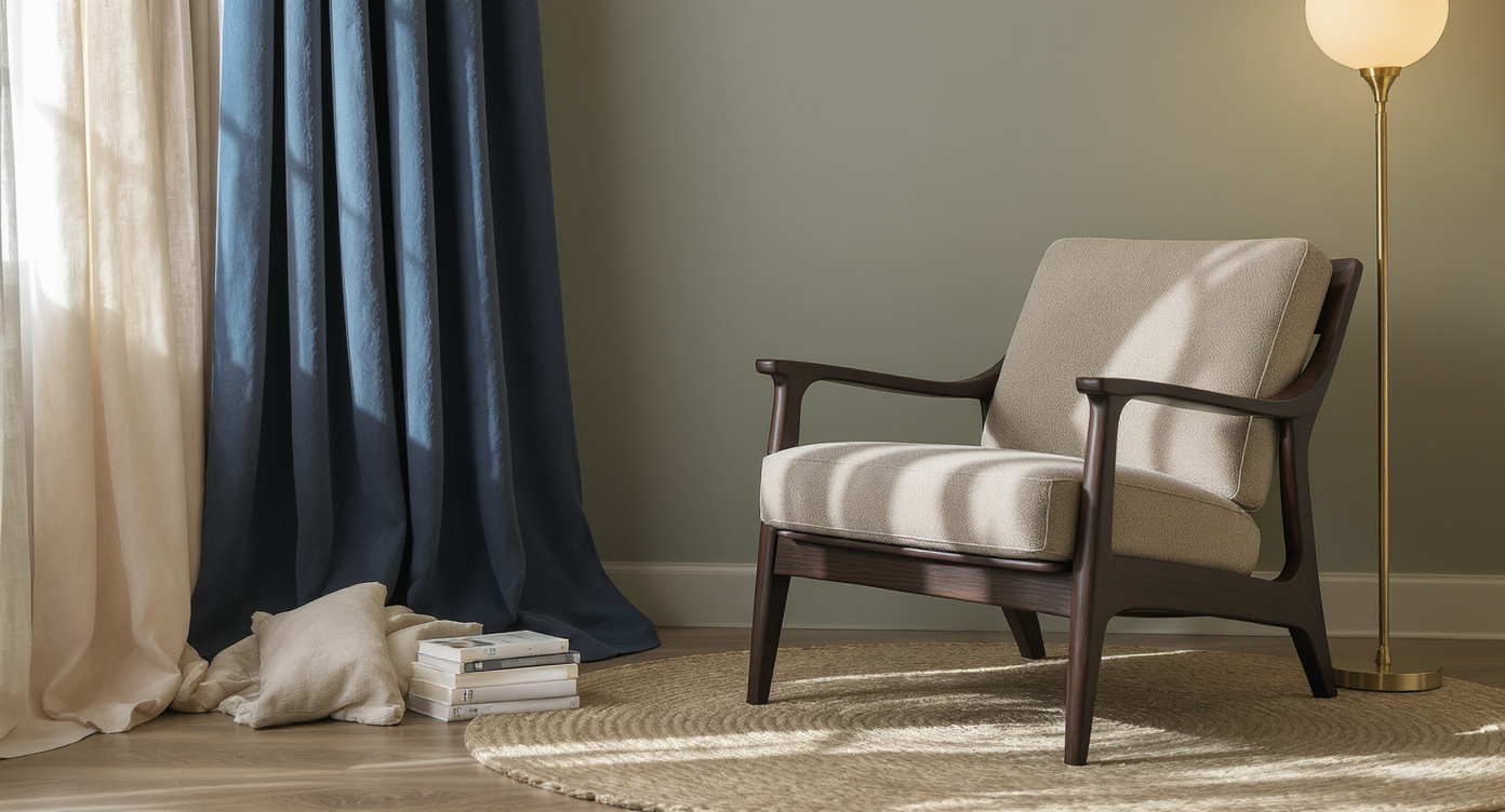
Enveloping spaces depend on layered textiles. Aim for drapery fullness at 2–2.5× the window width, hang rods 6–12 inches above the frame, and extend panels 8–12 inches beyond each side. Sofas feel loungey at 22–24 inches of seat depth and 17–19 inches of seat height. Ambient lighting should sit at 2700–3000K for warmth; mount sconces 60–66 inches off the floor for even eye-level glow.
Craft-led furnishings ground a room. One handmade piece per zone—a bronze side table, hand-woven textile, or turned wood stool—adds soul and reduces sameness. Look for fabric durability of 15,000+ double rubs (Wyzenbeek) for residential use, and prioritize FSC-certified woods and Greenguard or low-VOC finishes (under 50 g/L) to support well-being.
Nature-inspired colors are your palette: herbaceous greens, sea-washed blues, soft stone, and bark browns. Try a blue-gray for bedrooms (great for winding down) and moss or olive in kitchens where 71% of designers now prefer color over all-white. If you crave brights, tether them to natural materials—bold red with burl wood, cobalt with honed limestone—to keep the look sophisticated.
Sustainable, durable design lasts longer and ages better. Cork, wool, solid wood, natural stone, and linoleum (not vinyl) wear in, not out. Experts recommend testing samples in situ for a full 24 hours to see color shift and texture in your actual light.
User insight: Clients who trial swatches on three walls and compare at morning, midday, and evening choose the right color on the first try more than 80% of the time.
Anecdote
A family with an all-white kitchen wanted warmth without losing brightness. We painted cabinetry a soft olive, wrapped the island in oak, and added a hand-thrown ceramic pendant. The change was instant—morning coffee felt like sitting in a garden, and they stopped apologizing for the space when guests came over.
Avoid These Design Pitfalls
Small missteps can cancel the calm. Avoid these traps to keep 2025’s trends feeling elevated, not chaotic.
- All-white fatigue. Why it happens: defaulting to safe. Fix: shift to nature-inspired colors or warm whites with LRV 75–85, then add wood, stone, or plaster for dimension.
- Too many materials at once. Why it happens: excitement. Fix: limit to three primary materials per room and repeat them at least twice for cohesion.
- Ignoring acoustics. Why it happens: hard-surface overload. Fix: add rugs, lined drapery, upholstery, and even cork wall panels; soft surfaces cut echo and raise comfort.
- Shiny overload. Why it happens: chasing “glam.” Fix: pair one high-gloss element with matte or honed textures so reflections feel intentional.
- Greenwashing. Why it happens: vague labels. Fix: look for real certifications (FSC, Greenguard, OEKO-TEX) and repairable, long-warranty items.
Insider Moves Designers Swear By
To nail quiet luxury with personality, dial in a few precision moves. These expert tactics help trends translate to real life.
- Map your color story. Designers often advise allocating 60% calming neutrals, 30% nature hues, 10% saturated accents for balance.
- Repeat finishes strategically. Echo a stone veining in a textile, or the tone of dark wood in a leather strap or frame for a collected feel.
- Go sculptural. One standout curved sofa or ceramic lamp can carry a room; keep neighboring pieces quieter.
- Test reflectivity. A single mirror wall panel can brighten a moody room; smoked sections keep it sophisticated.
- Commission one piece. A local maker’s stool, light, or art adds provenance and becomes a daily-use heirloom.
- Conversation pit, modernized. If you’re building steps, keep risers 6–7 inches and include dimmable LED strips for safety and ambiance.
- Drench selectively. Try plaster or wood on 70–80% of surfaces, then add a gloss-painted door or lacquered table for lift.
Reflection: Every home has a tempo. The best rooms find the beat—slow where you rest, upbeat where you gather—and design the soundtrack with color and texture.
Tools, Ideas, and Quick Resources
A few smart helpers make decisions easier. Use these resources to preview color, texture, and layout without guesswork.
- ReimagineHome to visualize material drenching, nature-inspired colors, and furniture layouts in your exact room.
- Paint calculators and LRV charts from major paint brands for planning drenching and mood.
- Certifications to know: FSC for wood, Greenguard Gold for low emissions, OEKO-TEX for textiles, Declare labels for material transparency.
- Sample kits: order 12×12 inch tile or stone, fabric memos, and 24×36 inch paint swatches to test at scale.
Suggested image alt text and captions:
- Alt text: Material-drenched plaster living room with ecru walls and curved sofa. Caption: Material drenching amplifies mood through texture.
- Alt text: Dark wood library with layered drapery and brass sconces. Caption: Enveloping spaces pair depth with warmth.
- Alt text: Handcrafted bronze side table beside moss-green sofa. Caption: Craft-forward furnishings add soul and longevity.
Visualization Scenario
Picture a small den: plastered walls in misty blue, wool rug underfoot, a low curved sofa in ink velvet, and a single smoked-mirror panel catching afternoon light. Brass sconces glow at eye level, and a hand-turned wood stool doubles as a perch for tea. It’s quiet, moody, and unmistakably yours.
FAQs on 2025 Interior Design Trends
- How do I use material drenching in a small room?
Use one tactile material on 60–80% of surfaces and keep the color light (LRV 60+). Pair with a single reflective accent to prevent the space from feeling cramped. - What are the best nature-inspired colors for 2025?
Herbaceous greens, sea-washed blues, bark browns, and soft stone dominate. Designers recommend tying colors to your actual landscape for a timeless effect. - How should I mix quiet luxury with maximalism?
Start with quiet foundations—plaster, linen, dark wood—then add one statement pattern and one sculptural piece. Keep the 60-30-10 color balance to avoid overload. - What sustainable and durable materials should I choose at home?
Opt for cork, wool, solid wood, linoleum, and natural stone with real certifications like FSC and Greenguard. Low-VOC finishes (under 50 g/L) support healthy air. - How do you create enveloping spaces without making a room dark?
Layer texture (lined drapery, rugs, upholstery) with warm 2700–3000K lighting and targeted gloss or mirror to bounce light. Keep ceilings one shade lighter to lift the room.
The Takeaway
This year is about feeling as good as it looks. Blend calm neutrals with color that nods to the outdoors, choose durable, sustainable materials, and let at least one handcrafted piece tell a story. If you keep the palette intentional, the textures generous, and the lighting warm, your home will feel both current and deeply personal.
Ready to see it before you commit? Mock up drenching, test drapery fullness, and audition that moss-green sofa with ReimagineHome—a quick way to turn 2025’s trends into your everyday reality.