
TL;DR
Calming blue palettes—led by Cerulean, with Robin’s Egg and Wisteria close behind—are shaping 2025 home aesthetics. Use them as confident accents or soft backdrops, and preview every choice in seconds on ReimagineHome.ai to avoid guesswork and waste.
Why Blue-Centric Interiors Matter Right Now
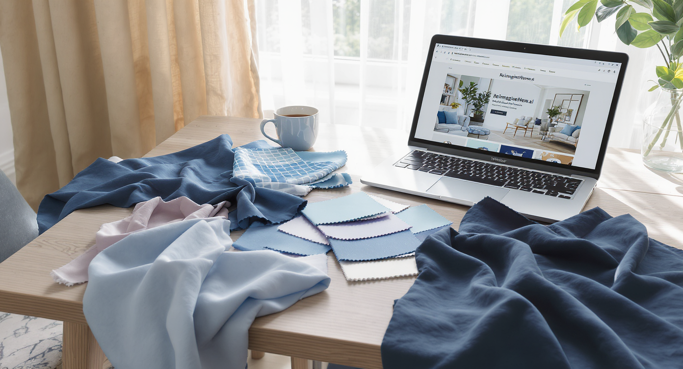
Exploring favorite blues and AI tools sets the stage for personalized 2025 interior color trends.
Cerulean ranked first in Crayola’s recent Global Color Vote in 46 of 50 U.S. states and topped charts in the UK, Canada, and Australia. Translation for interior design styles: the world’s favorite hue is calm, optimistic, and perfectly timed for 2025 trends and home aesthetics.
TL;DR
• Cerulean is a clear, timeless blue; Robin’s Egg leans lighter with a soothing green cast; Wisteria introduces a powdery violet that plays beautifully with natural materials.
• Use the 60-30-10 color rule for balance, warm up with wood and brass, and watch lighting temperatures.
• Try your own design ideas instantly on ReimagineHome.ai.
At a glance
- How to choose the right blue for your light and layout
- Paint vs textiles vs cabinetry: where to place color
- Undertones and pairings (wood, metal, stone)
- Rental-friendly swaps (art, rugs, slipcovers)
- Compare Cerulean to Robin’s Egg, Wisteria, and Navy
- Step-by-step: visualize it all in ReimagineHome.ai
Try your own design ideas instantly on ReimagineHome.ai.
The Rise of Cerulean and Its Sister Shades — What’s Driving It

Cerulean and sister blues create a layered, inviting palette driving 2025 color trends.
46 out of 50 states chose Cerulean as their favorite Crayola color, signaling a mainstream pivot toward serene yet confident design trends. In a year when emerging interior design trends 2025 favor restorative spaces, blue’s link to sky and water makes it emotionally resonant and visually adaptable.
Designers and color psychologists routinely note people prefer lighter blue-green families over harsher warm hues. Cerulean delivers the sweet spot: saturated enough to feel modern, not so dark that it shrinks a room. Robin’s Egg reads airy and optimistic, a natural for small-space living rooms and entryways. Wisteria adds a whisper of purple that softens hard lines in modern interiors.
Beyond mood, blue is practical. It pairs with oak, ash, walnut, travertine, linen, and unlacquered brass—the materials already steering 2025 interior design styles. The palette slides comfortably from coastal to quiet luxury, contemporary to modern rustic. When trends bend, blue bends with them.
Anecdote
A couple who swore they were "not color people" used ReimagineHome.ai to test three concepts. The winning scheme? Cerulean island, Robin’s Egg walls, unlacquered brass—installed over one long weekend.
Key Elements That Define a Cerulean-Forward Space
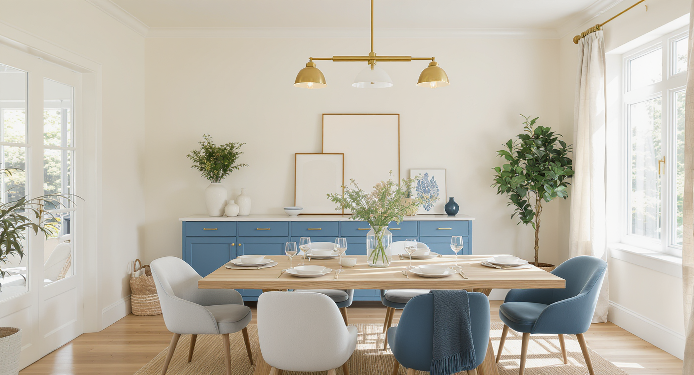
Applying the 60-30-10 rule with cerulean balances color, texture, and warmth beautifully.
The 60-30-10 color rule remains the most reliable formula for balance: 60% base neutrals, 30% supporting hue, 10% accent. For blue-forward rooms, that typically means warm neutral envelopes, Cerulean or Robin’s Egg on cabinetry or upholstery, and crisp white or brass as the accent.
Colors: Cerulean reads as a clean mid-blue; Robin’s Egg has a subtle green undertone that glows in daylight; Wisteria is a light purple that pairs well with taupe and travertine. If your room is north-facing, expect any blue to read 1–2 steps cooler; compensate with warmer bulbs (2700–3000K) and honeyed woods.
Textures and materials: Grainy oak, rift-cut walnut, fluted plaster, boucle, linen, and unlacquered brass soften blue’s clarity. High-gloss Cerulean on a kitchen island adds reflection and depth; matte or eggshell on walls keeps things calm.
Forms: Curved sofas and drum side tables make saturated blues feel inviting, while linear Shaker fronts or flat-panel cabinets keep the look modern. For dining pendants, designers recommend hanging fixtures 30–36 inches above the table for ideal ambiance and proportion.
Where to place color:
• Paint: Test two sheens. Eggshell masks wall texture; satin is wipeable for kitchens and baths.
• Millwork: A Cerulean island or vanity can carry the 30% “color” load on its own.
• Textiles: Introduce Robin’s Egg through linen drapery; keep LRV (light reflectance value) of walls in the 60–70 range if you want an airy backdrop for Wisteria accents.
How ReimagineHome.ai Helps You Visualize Blue Interiors
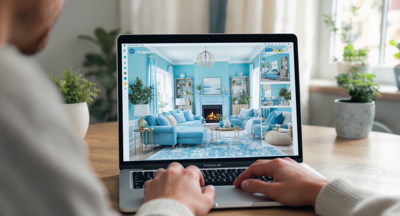
ReimagineHome.ai empowers instant visualization of vibrant blue interiors for home design.
In under 60 seconds, ReimagineHome.ai turns a photo of your room into multiple blue-forward concepts you can compare side by side. That speed and clarity make it the modern interior design style guide you actually use.
Step-by-step:
1) Upload a photo of your space at ReimagineHome.ai.
2) In your prompt, name the style and hue: “Modern kitchen with Cerulean island, warm oak, unlacquered brass, 2700K lighting.”
3) Generate versions that test alternatives: Robin’s Egg walls, Wisteria textiles, or Navy lower cabinets.
4) Compare lighting temperatures, material pairings, and color placement, then save the render you love.
Go deeper with these reads on the ReimagineHome.ai blog:
• How to Visualize Paint Colors Before You Buy
• Choosing Your Interior Design Style: 2025 Guide
• Emerging Interior Design Trends 2025: AI Room Transformations
Style Comparisons — Cerulean vs Robin’s Egg vs Wisteria (and Navy)
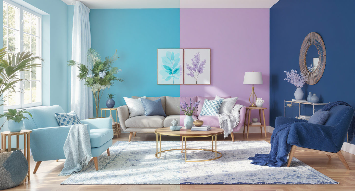
Comparing cerulean, robin’s egg, wisteria, and navy reveals nuanced blue styling in modern interiors.
Most homes successfully blend 2–3 influences, so understanding nuance helps you choose an interior design style that feels cohesive. Here’s how the top blues diverge:
Cerulean vs Robin’s Egg: Cerulean is clearer and slightly stronger; it excels on focal points like a kitchen island, front door, or built-in bookcase. Robin’s Egg is lighter with a greenish undertone, better for whole-room application, bedrooms, and small spaces where you need lift.
Cerulean vs Wisteria: Wisteria brings a romantic, lilac-tinged calm that pairs wonderfully with travertine and parchment fabrics—great in powder rooms or layered upholstery. Use Cerulean where you want structure and crispness; use Wisteria where you want softness.
Cerulean vs Navy: Navy is moodier and can visually compress a room; it’s ideal for dining rooms or studies. Cerulean offers presence without heaviness. If you love navy, try Cerulean cabinetry with navy textiles to keep contrast gentle.
Visualization Scenario
Prompt: “Modern eclectic living room, Cerulean built-ins, Robin’s Egg walls, oak herringbone floors, brass picture lights, 2700K bulbs, linen sofa, Wisteria throw.”
FAQ
Five quick answers address the most-searched blue-interior questions for 2025.
Is Cerulean a 2025 trend or a timeless choice?
Cerulean is both: it leads emerging interior design trends 2025 and reads classic alongside oak, linen, and brass. It’s safer than a fleeting accent color.
How do I choose between Cerulean, Robin’s Egg, and Wisteria?
Start with light: bright rooms handle Cerulean easily; low-light spaces favor Robin’s Egg or Wisteria. Use ReimagineHome.ai to compare undertones in your actual room.
What metals and woods pair best with blue?
Unlacquered brass, brushed brass, and aged bronze add warmth; oak, ash, and walnut ground the palette. Stone choices like travertine and limestone keep it elevated.
Will blue make my small room feel smaller?
Not if you control placement. Keep deeper blues below eye level and use lighter walls (LRV 60–70). Mirrors and 2700–3000K bulbs help maintain warmth.
How can I visualize before painting or buying?
Upload a photo to ReimagineHome.ai, generate versions with different blues, and preview finishes, lighting temps, and materials side by side.
Visualize Your Home with Cerulean
In apartments under 700 square feet, color placement affects perceived scale by as much as a full “size” category when you keep the deepest hue below eye level. That’s why a Cerulean vanity, island, or low media console feels lush without overpowering a compact plan.
Three real-world stories:
• Small space: A 380-square-foot studio swapped a gray rug for a Cerulean wool flatweave and added Wisteria pillows. Result: The neutral sofa stayed, but the room felt intentionally styled.
• Rental kitchen: Peel-and-stick Robin’s Egg backsplash plus brass knobs updated a white rental in a weekend; ReimagineHome.ai previews kept the pattern scale and color intensity on target.
• Color-shy bedroom: One wall in light Robin’s Egg (LRV ~70) with linen drapery, then a Cerulean throw at the foot of the bed. Calm, dimensional, zero visual clutter.
Mistakes to avoid:
• Overcool lighting: 4000K bulbs will push blue toward icy. Fix with 2700–3000K.
• All-blue everything: Without warm woods or brass, blue turns flat. Add texture and a warm metal.
• Ignoring undertone: Pair Cerulean with neutral whites; Robin’s Egg wants stone or beige.
• Skipping samples: Always test on two walls and observe AM/PM.
• Scale mismatch: Large, saturated blues need heavier textures to balance.
Pro tips to get it right:
• Use the 60-30-10 rule and keep your 10% as a bright metal or crisp white to make blue sing.
• Hang pendants 30–36 inches above counters; leave 3 inches between cabinet edge and pendant diameter for breathing room.
• For rugs, allow 8–10 inches of floor reveal around the perimeter.
• In low-light rooms, lift your wall color 1–2 tints lighter than the swatch you love.
• On cabinets, satin finishes hide wear better than high gloss in busy kitchens.
Blue is both trend and timeless, which is why it suits the modern home aesthetics we’re craving. Ready to see your space in Cerulean, Robin’s Egg, or Wisteria? Visualize your home with ReimagineHome.ai and turn that favorite hue into a room you love.