
TL;DR
Exterior render is a fast, photo-based way to visualize front door colors, glass treatments, and trim before you buy paint or hardware. It’s ideal when you’re unsure how cool blues, warm brick, or black-on-beige will really look together. Try an AI exterior render from a single photo with ReimagineHome.ai’s exterior rendering tool to compare sage, teal, black, maroon — even frosted sidelites — side by side. It saves time, avoids paint regret, and helps you land on a confident curb appeal choice.
The Real Cost of Showing Exteriors “As You Imagine Them” — Not As They’ll Look
Explore multiple front door colors, glass privacy, and trim options digitally before painting.
Exterior render is a digital preview of your facade — door color, sidelites, trim, even hardware — generated from a single photo. It matters because curb appeal decisions hinge on undertones and light; what reads like a calm blue in the store can turn gray and clash against warm brick in daylight.
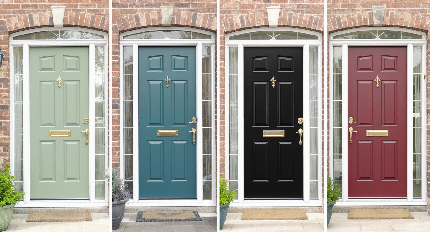
- Results: See multiple front door colors (sage, teal, black, maroon), glass privacy options, and trim in minutes.
- Realism: Photo-anchored, perspective-aware edits that respect your architecture and natural light.
- Speed: Upload, pick styles, compare, and decide in a single session.
- Cost: Avoid mis-buys in paint, hardware, and glass treatments.
- Workflow: Generate a few alternatives, share, vote, then paint once.
- ROI: Better curb appeal supports higher perceived quality and faster buyer confidence.
- Peace of mind: Test cool vs. warm tones before committing to a brush.
If you already have an exterior photo in mind, upload it to ReimagineHome.ai and test this on a real image while you read.
Why This Visual Problem Hurts More Than You Think
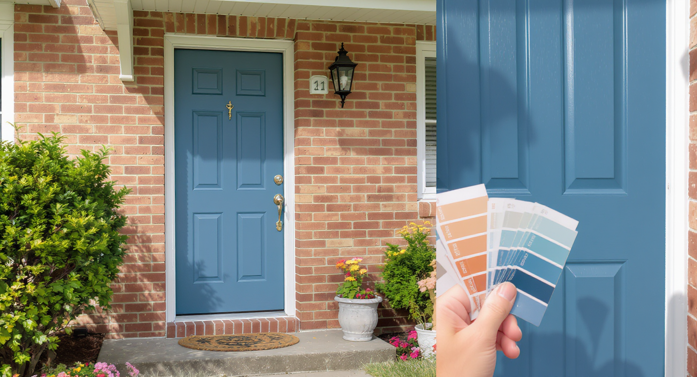
Mismatch between paint swatches and real lighting can hurt your home’s curb appeal more than you think.
First-glance exterior photos often drive more listing clicks than any single interior shot, so a mismatched front door color can quietly depress engagement. When a cool, gray-leaning blue sits next to warm brick, the clash reads as “off” and buyers or guests keep scrolling. Even homeowners second-guess themselves when the door looks faded or the sidelites feel too exposed.
Here’s how it shows up in real life: people call a color “blah,” “washed out,” or “not quite right” without knowing why. It’s undertones. Warm masonry wants warmth or a complementary hue with enough saturation. Glass choices matter too; clear full-height sidelites bring light, but if privacy anxiety kicks in, they can overshadow everything else you did right.
Exterior render gives you quick, side-by-side comparisons, so you can test a richer teal, a warmer sage, a classic maroon, or the trending glossy black — plus try frosted glass — until the composition feels intentional.
Anecdote
That perfect-but-iffy entry: the blue door that felt gray in daylight and a pair of clear sidelites that made the foyer bright — and the owners uneasy. A quick render swapped in a warmer sage and frosted glass, and the facade finally looked like it belonged on the street.
What Exterior Render Actually Is (In Plain Language)
Exterior render previews your facade’s changes quickly with realistic photo-based visualizations.
Exterior render is a photo-based visualization that lets you preview facade changes — from front door paint color and sheen to sidelites privacy treatments and trim — on your actual home image. You upload a clear exterior photo, choose the changes you want to explore, and receive realistic alternatives you can compare instantly.
With ReimagineHome.ai’s exterior rendering solution, you work from a single, straightforward image. The output is a set of high-quality previews that respect your architecture, perspective, shadow directions, and material context, so decisions are made on reality, not guesswork.
How Exterior Render Works Step by Step

See how easy turning your photo into realistic design previews can be with exterior render tech.
Start with a well-lit, straight-on or slight-angle exterior photo for the best results with AI exterior rendering from a photo.
- Pick the right photo: Aim for daylight with balanced exposure; 3000+ pixels on the long edge is a good rule of thumb for crisp outputs.
- Upload to ReimagineHome.ai: Your image anchors every change so proportions and edges stay believable.
- Select Exterior Render: Choose the front door area as your focus; note if you want to preview sidelites as clear, frosted, or patterned.
- Choose palettes and finishes: Test warm greens (sage, moss), deeper blues (teal, naval), classic reds (oxblood, maroon), or glossy black. Try satin vs. high gloss to see how reflections play.
- Generate and compare: Produce multiple looks and evaluate undertones against your brick, stone, or siding.
- Refine the winner: Tweak saturation, add a coordinating trim color, or cool down a too-warm choice until it clicks.
- Export: Download MLS-ready or homeowner shareable images for alignment with partners, contractors, or family.
Constraint to remember: very dark colors emphasize surface imperfections. If your door has dings or filler, preview satin instead of mirror-gloss to keep it elegant and forgiving.
Tips and Tricks for More Realistic Results

Master subtle lighting and color details for more realistic and appealing exterior renders.
Realistic exterior renders start with believable light, accurate scale, and colors that honor your home’s fixed materials.
- Match undertones first: If your brick is warm, a warm-leaning green (sage, olive) or a saturated teal with some yellow in it often lands better than a cool gray-blue.
- Increase saturation, not darkness: A slightly richer hue can feel intentional without going nearly black.
- Test sheen realistically: Satin reads premium without amplifying every dent; high gloss suits smoother doors and traditional looks.
- Coordinate metals: If your sconces and mailbox are bronze, preview a warmer door color; if they’re black, a black or deep teal door can tie it all together.
- Try privacy options: Clear sidelites are bright, but frosted or reeded glass can add texture and privacy without killing light. Render both to decide.
- Calibrate with daylight: Evaluate your renders on a phone outdoors; natural light reveals undertones a monitor can hide.
- Consider trim: Sometimes the magic isn’t a new door color — it’s painting the surround or header a contrasting off-white or charcoal for definition. If you want to test just color changes, you can also explore ReimagineHome.ai’s surface restyling tool to recolor specific elements like trim.
Visualization Scenario
Upload a straight-on photo of your porch. Generate four variants: sage satin, teal satin, maroon semi-gloss, and black gloss. Then duplicate the winner and toggle sidelites from clear to frosted to confirm privacy without losing light.
FAQ
FAQ
What is an exterior render for front doors?
It’s a photo-based preview that shows how different door colors, sidelites (clear vs. frosted), and trim will look on your actual facade. You can generate multiple options in minutes and compare them side by side.
How do I choose a front door color with warm brick?
Favor warm-leaning greens (sage, olive), richer teals, or classic maroons. Use ReimagineHome.ai’s exterior rendering tool to test undertones and saturation against your brick in real light.
Can I preview frosted sidelites vs. clear glass?
Yes. You can render clear, frosted, or textured looks to balance light and privacy before ordering glass or film.
Will the render match real-world paint colors exactly?
Renders are highly realistic for composition, sheen, and undertone. Always confirm your final pick with a physical paint sample, but the render gets you 90% of the way there.
What resolution photo should I use?
Use a well-lit exterior at 3000+ pixels on the long edge for clean edges and accurate color. Avoid heavy shadows or extreme tilt if possible.
Visualize Your Next Listing (or Project) Before You Commit
Where Exterior Render Totally Changes the Game
Even small curb appeal pivots become obvious when you see them. Picture this:
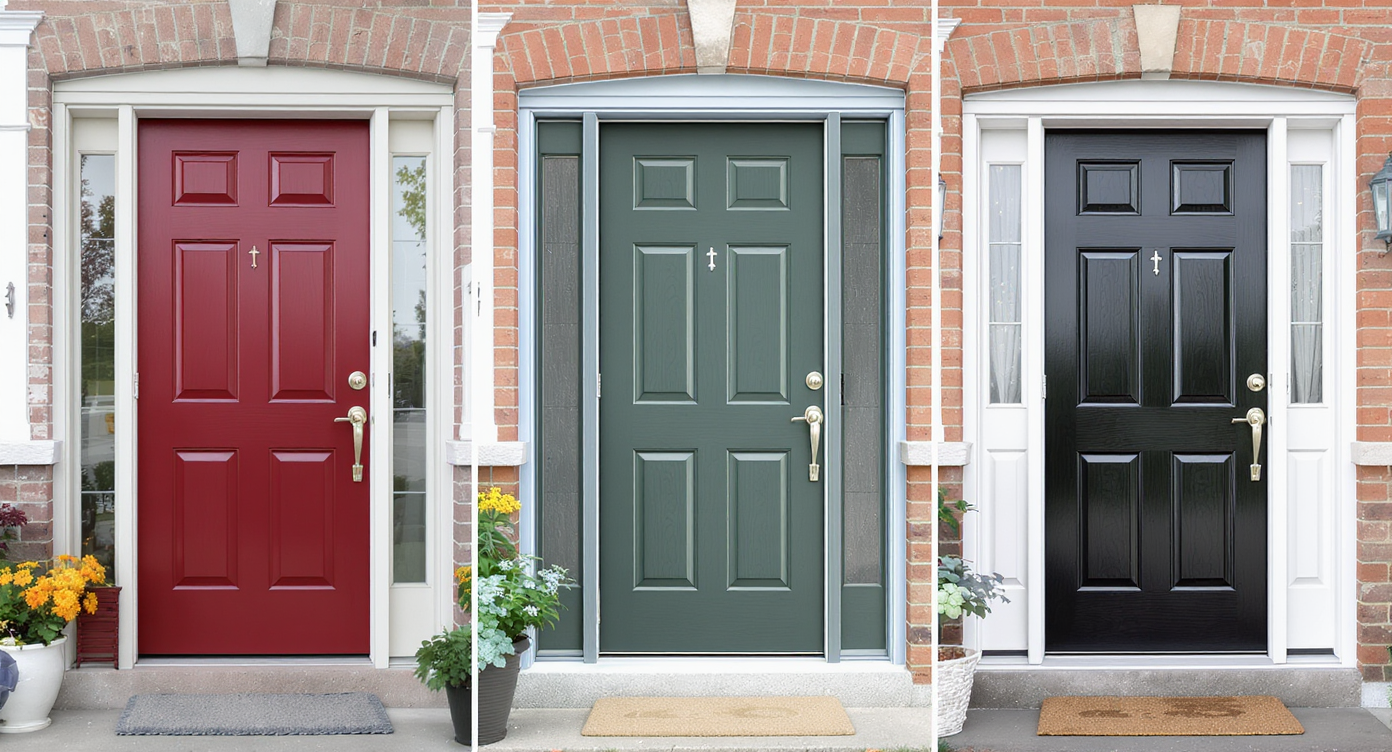
- The blue-that-reads-gray: On a beige brick facade, it looked washed out. A render with a warmer green (sage) instantly felt cohesive; the house looked newer without replacing a thing.
- Sidelites second thoughts: Full-height clear glass made the entry bright — and the homeowner anxious. A frosted render preserved the daylight and solved the privacy dilemma in one decision.
- The black trend test: Black looked sharp in isolation, but with bronze lighting it felt harsh. A deep teal plus satin finish bridged the metal tone, kept contrast, and added personality.
No promises of miracles — just clearer, faster decisions and fewer paint misfires. That’s the quiet power of realistic exterior rendering.
Common Mistakes with Exterior Render (and Easy Fixes)
Most disappointment comes from weak source photos and ignoring undertones, not the rendering tool itself.
- Tiny or blurry photos: Use high-resolution images (ideally 3000+ px long edge) for clean edges and true color.
- Pushing edits too far: If it looks plastic, dial down gloss or saturation and respect existing materials.
- Undertone mismatch: Warm brick + cool gray-blue equals clash. Add warmth or choose complementary saturation.
- Ignoring the hardware story: Coordinate door color with sconces, house numbers, and mailbox finishes.
- Forgetting privacy: Preview clear vs. frosted sidelites before you commit to glass.
Who Gets the Most Value from This Tool
Anyone making curb appeal decisions benefits from a try-before-you-buy render.
- Agents and teams: Faster, more confident curb appeal guidance; improved listing hero shots.
- Brokerages and marketing staff: Standardized visuals for brand-consistent renovations or refreshes.
- Photographers and media companies: Easy upsell — deliver alternate front door color sets alongside twilight shots.
- Sellers, flippers, investors: Save on paint iterations; align stakeholders in a day, not weeks.
- Designers and homeowners: Translate vibe words (quiet luxury, classic, bold) into a precise, testable color-and-glass combo.
Ready to preview your best front door color and glass in minutes? Explore ReimagineHome.ai’s Exterior Render or start from the home page and upload your facade photo now.