TL;DR
Nothing is “wrong.” The space is reading cool up top and warm/busy below. Fix the lighting first (2700–3000K, diffused), add a long runner to calm the herringbone, bring the wood tone upward (shade, shelf, accessories), and soften a few details (window treatment, transition strip). Optional paint in a warm white/greige will tie it all together.
What’s actually throwing you off

Cool top lighting contrasts with warm patterned herringbone floor in this small white kitchen setting.
You didn’t do anything “wrong.” The floor is gorgeous, but in a small white kitchen it becomes the star — especially under very cool, harsh lighting. What you’re feeling is: 1) cool top (cabinets/counter/backsplash + blue‑white bulbs) vs warm, patterned bottom (herringbone with variation), and 2) strong directional movement from the herringbone. Both are easy to balance with lighting, textiles, and a few warm repeats up high.
Do these first (biggest impact, low cost)

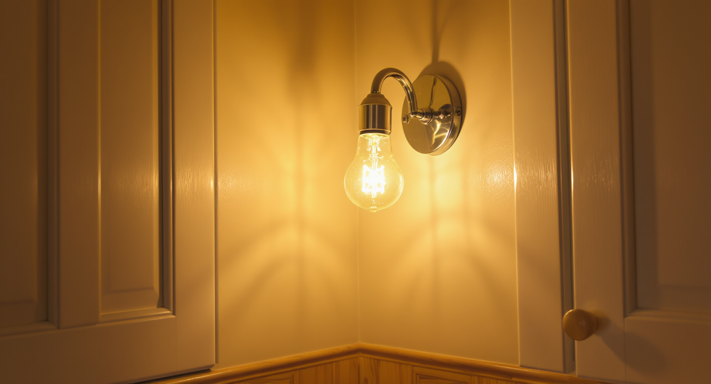
Swapping to warm white LED bulbs warms the kitchen and enhances wood floor tones effectively.
1) Swap bulbs now. Use 2700–3000K “warm white” LED with high CRI (≥90). Philips Warm Glow or Feit Enhance are great. Add a dimmer. 2) Add a long runner to calm the pattern. Flatweave or low‑pile, washable, non‑slip. See Section 4 for colors/sizes. 3) Layer under‑cabinet lighting in the same 2700–3000K. Inexpensive plug‑in or tape LEDs with diffusers will warm the counters and reduce reliance on the overhead. 4) Add a few warm, natural textures at eye level: a wood cutting board leaned vertically, wooden/copper utensil crock, a small plant, and a woven/linen hand towel. 5) Declutter and consolidate white appliances; let the few warm accents read clearly.
Anecdote
Clients almost always think they chose the “wrong” floor. Nine times out of ten it’s the bulbs. We swapped in 2700K, added a runner, and the floor instantly felt custom instead of chaotic.
Next upgrades (weekend projects)

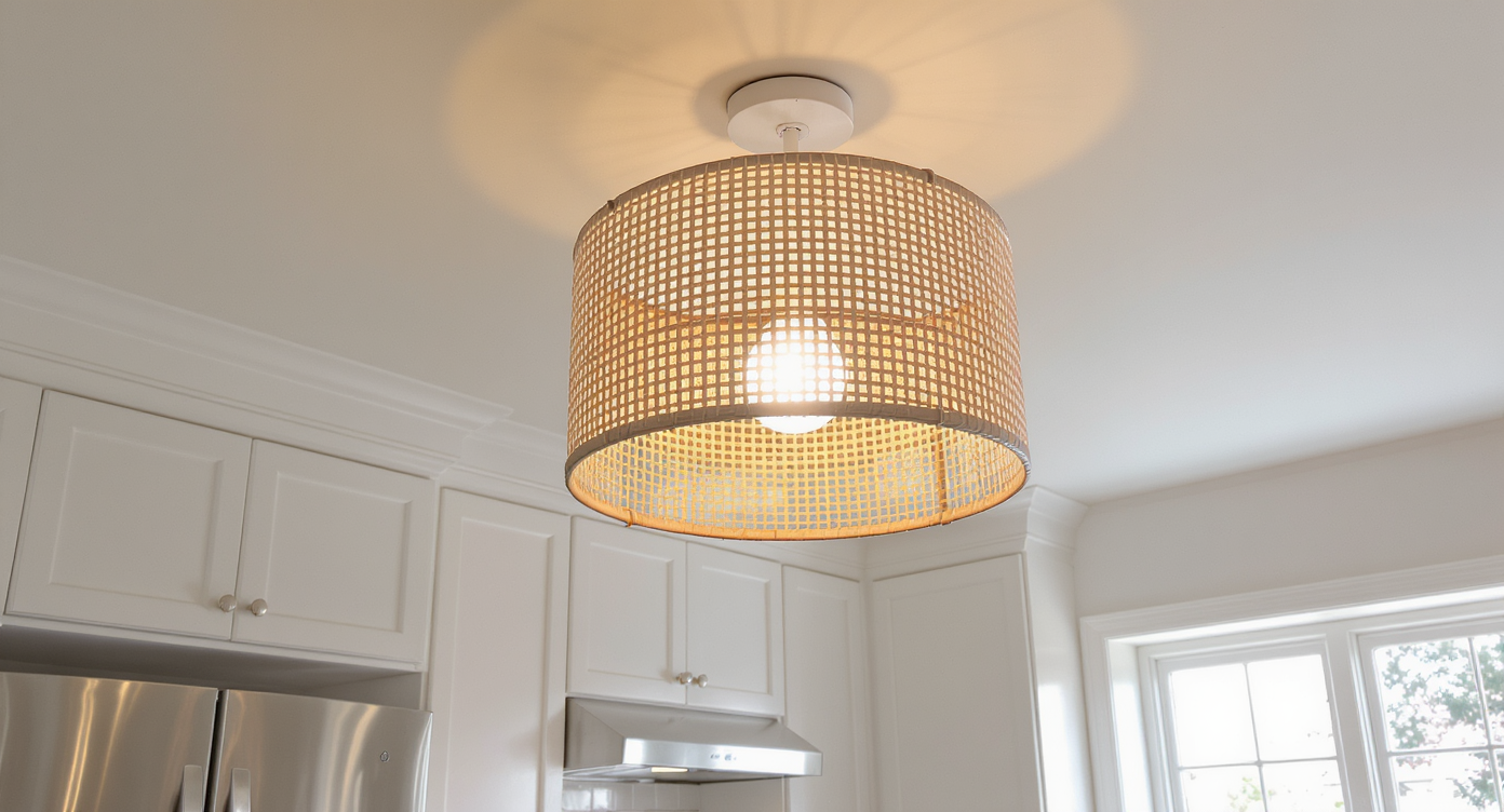
Upgrading to a diffused rattan ceiling light adds warmth and unity to the kitchen’s vibe.
1) Replace the ceiling fixture with a diffused semi‑flush drum, schoolhouse, or a simple rattan/brass piece to match your hardware. Avoid exposed, cool bulbs. 2) Window treatment: a natural woven Roman shade (light oak, wheat, or honey) or a warm linen cafe curtain. This visually lifts the wood tone. 3) Change the gold threshold/transition strip to wood (stained to either space) or a dark bronze/black so it disappears. 4) If there’s a small gap above cabinets, either extend crown/filler to the ceiling or add soft cove/top lighting at 2700K to kill the shadow line. 5) If a black seam/caulk in the stone corner is visible, switch to a color‑matched caulk to reduce visual noise.
Optional paint tweaks that bridge warm floor + cool marble

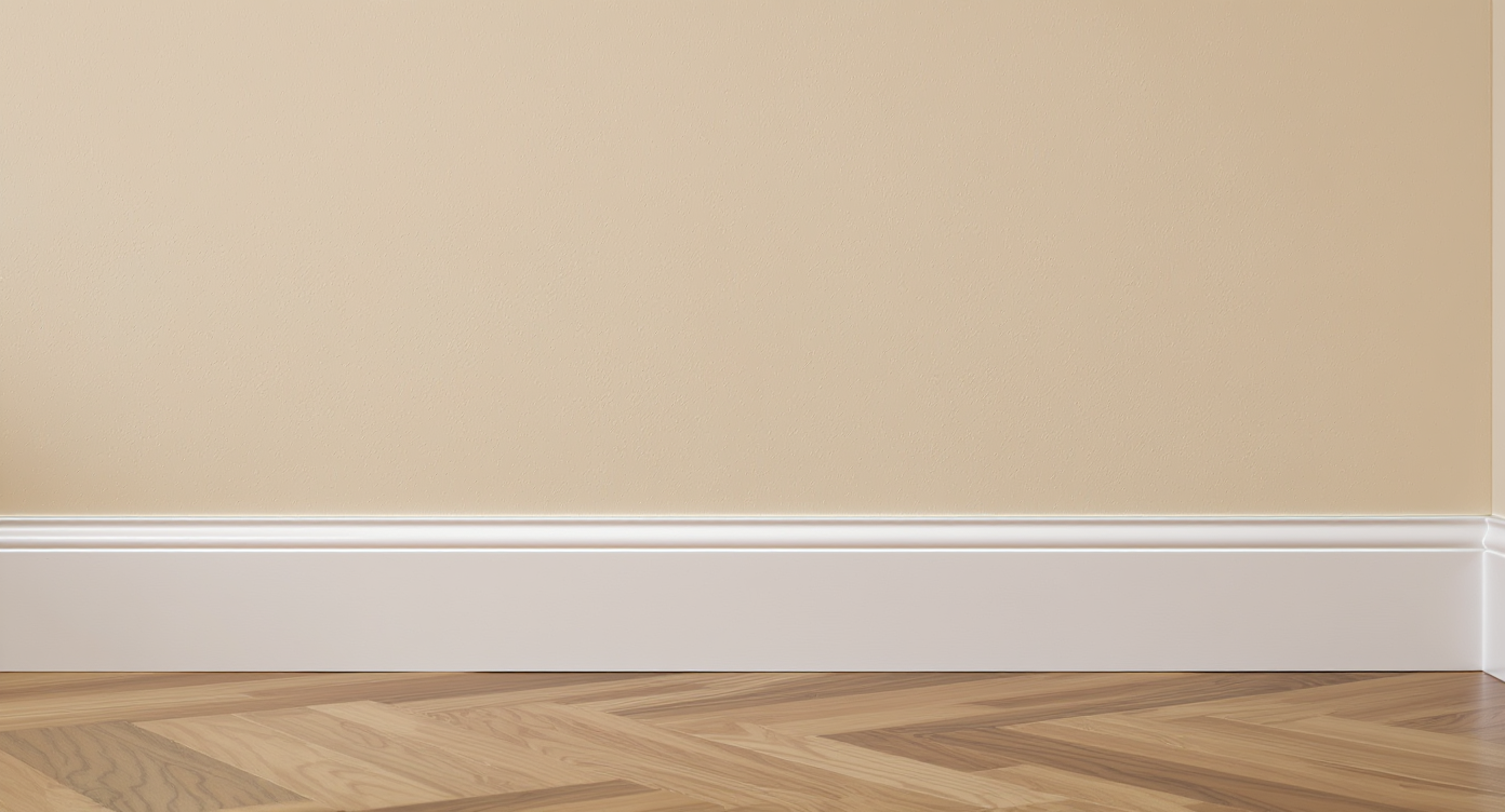
Warm beige paint walls create a subtle bridge between cool marble and warm wood floor tones.
Pick one approach: warm the walls slightly or match the cabinets for continuity. Good bridge colors that flatter warm wood and cool marble: • Warm whites/greiges: Benjamin Moore White Dove (OC‑17), Swiss Coffee (OC‑45), Pale Oak (OC‑20), or Edgecomb Gray (HC‑173). • If you want contrast: a soft sage with warmth (BM Saybrook Sage HC‑114, SW Evergreen Fog 9130) on the small window wall only. Always sample next to both the floor and countertop under warm bulbs.
If you want a new runner: what colors and size work best

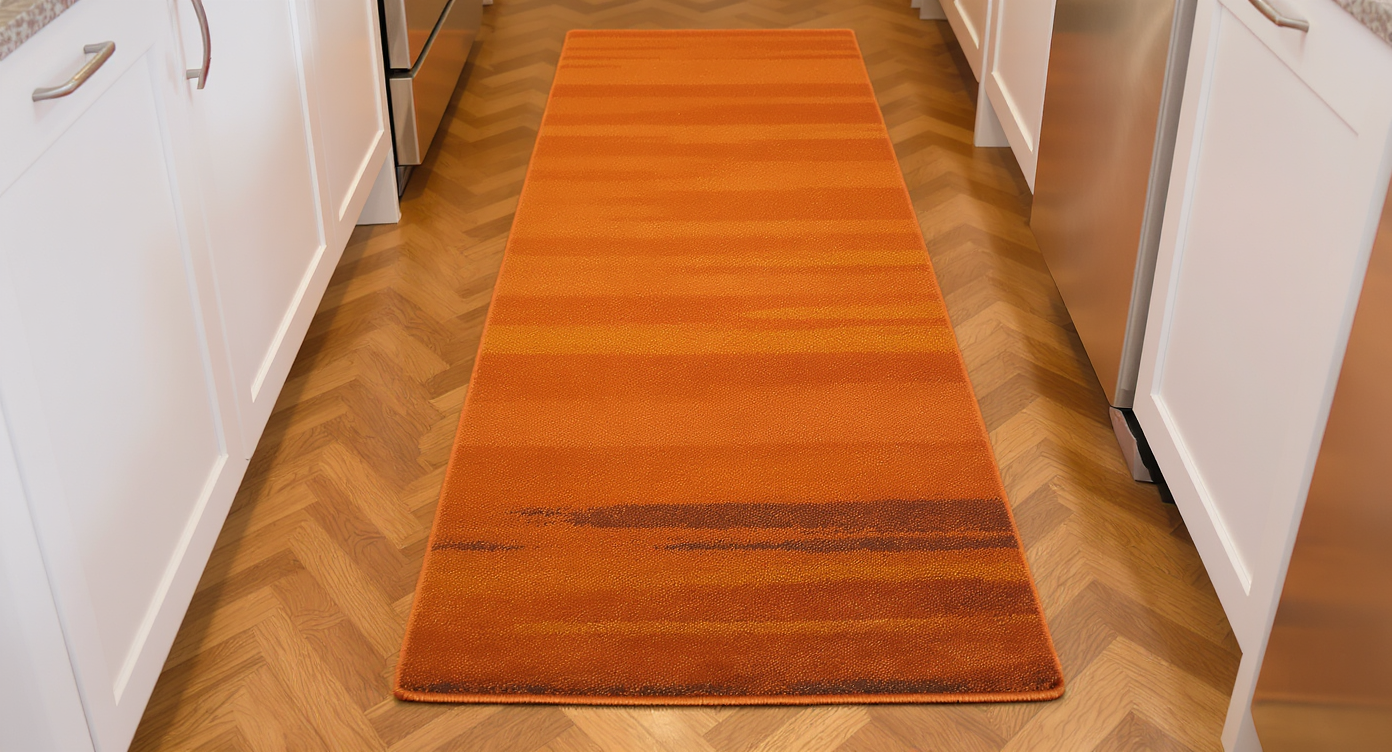
A warm terracotta runner centered in a galley kitchen ties floor and cabinetry hues beautifully.
Best sizes for a galley: 2'6" x 8–10' (or 3' x 8–10' if space allows). Center it, leaving 3–6" of floor along the runs. Colors that tie both halves together: • Warm neutral base (oatmeal/camel) with subtle gray/greige notes to echo the marble. • Vintage‑wash Persian in muted beige, taupe, ivory, with tiny hits of olive or terracotta. • Solid jute/sisal‑look in “oat” or “wheat” if you want zero pattern. Avoid bright white or blue‑gray runners; they’ll bring the cool back.
Visualization Scenario
Picture the same kitchen at dusk: a brass drum ceiling light dimmed warm, a soft glow under the uppers, a wheat‑colored woven Roman shade, a 2'6" x 9' vintage‑wash runner in camel/greige with tiny gray flecks, a tall cutting board behind a warm wood utensil crock, and a pothos trailing from the sill. The eye finally lifts off the floor and the room feels cohesive.
Quick answers
Q: Did the floor get laid the “wrong” direction? A: In a narrow galley, many prefer the pattern running with the length to guide the eye. It’s not worth tearing out—use a long runner to visually re‑orient and soften it. Q: Hardware color change? A: Keep your brass; repeat it in the light fixture. Only switch to black if you also repeat black in 2–3 places. Q: What exact bulbs? A: Look for 2700K–3000K, 90+ CRI, dimmable. Examples: Philips Warm Glow A19 (E26), Feit “Soft White” 2700K, or selectable‑CCT under‑cabinet lights set to 2700K.
Bottom line
Prioritize warm, diffused light and a long runner, then bring the wood tone up with a shade/shelf and a few accessories. If needed, adjust wall color. These quick, reversible tweaks will make the white kitchen feel intentional and the herringbone read as a feature—not a distraction.
