2026 Color Trend Explained for Real-World Interior Design
TL;DR
Home color trends in 2026 celebrate bold, earthy tones and unexpected brights, moving away from minimalism. Browns, dusky blues, ochre, and confident reds will define living spaces, offering both versatility and personality. Investing in color is about creating rooms that feel energized yet livable, and tools like ReimagineHome.ai make experimenting easier and less risky.
Why 2026 is the Year of Vibrant Color in Interiors
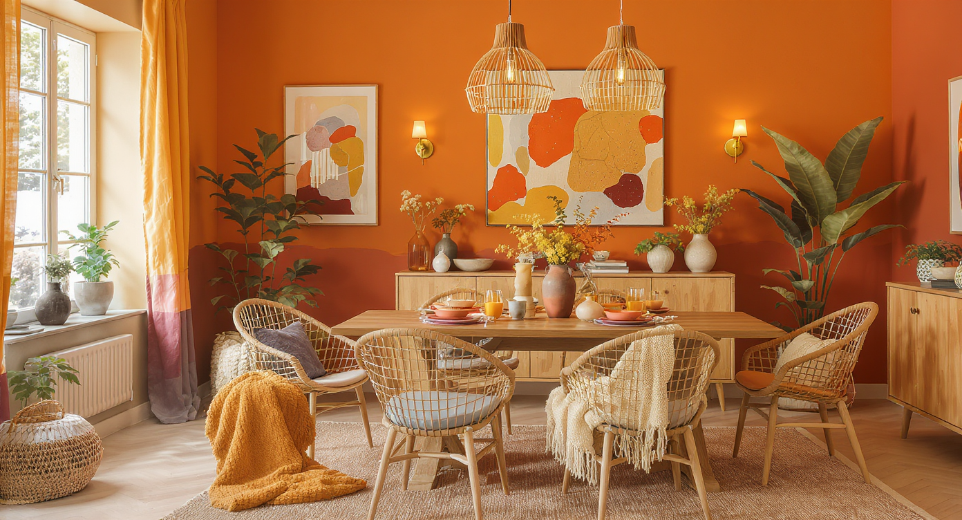
Embrace the warmth and expressiveness of color in this beautiful dining space, perfect for gatherings.
The 2026 color trend in interior design marks a shift away from quiet neutrals and a return to expressive shades that feel modern yet deeply inviting. Designers are introducing earthen browns, soft sky blues, ochres, and saturated reds to give homes renewed warmth and personality. This evolution isn’t about fleeting fads, but about using color as a foundation for comfort and self-expression, hallmarks that will anchor homes for years, not just a season.
Homeowners who once hesitated to take color risks are now seeking inspiration for spaces that look alive and lived-in. Whether through a statement wall or subtle pops, color is no longer relegated to the sidelines. Instead, these emerging palettes offer practical value, shaping mood, enhancing lived experience, and echoing larger themes such as wellness and connectedness, as 2026 home lifestyle trends demonstrate. The new question isn’t simply which color to use, but how to harness color in ways grounded in real-life living.
-
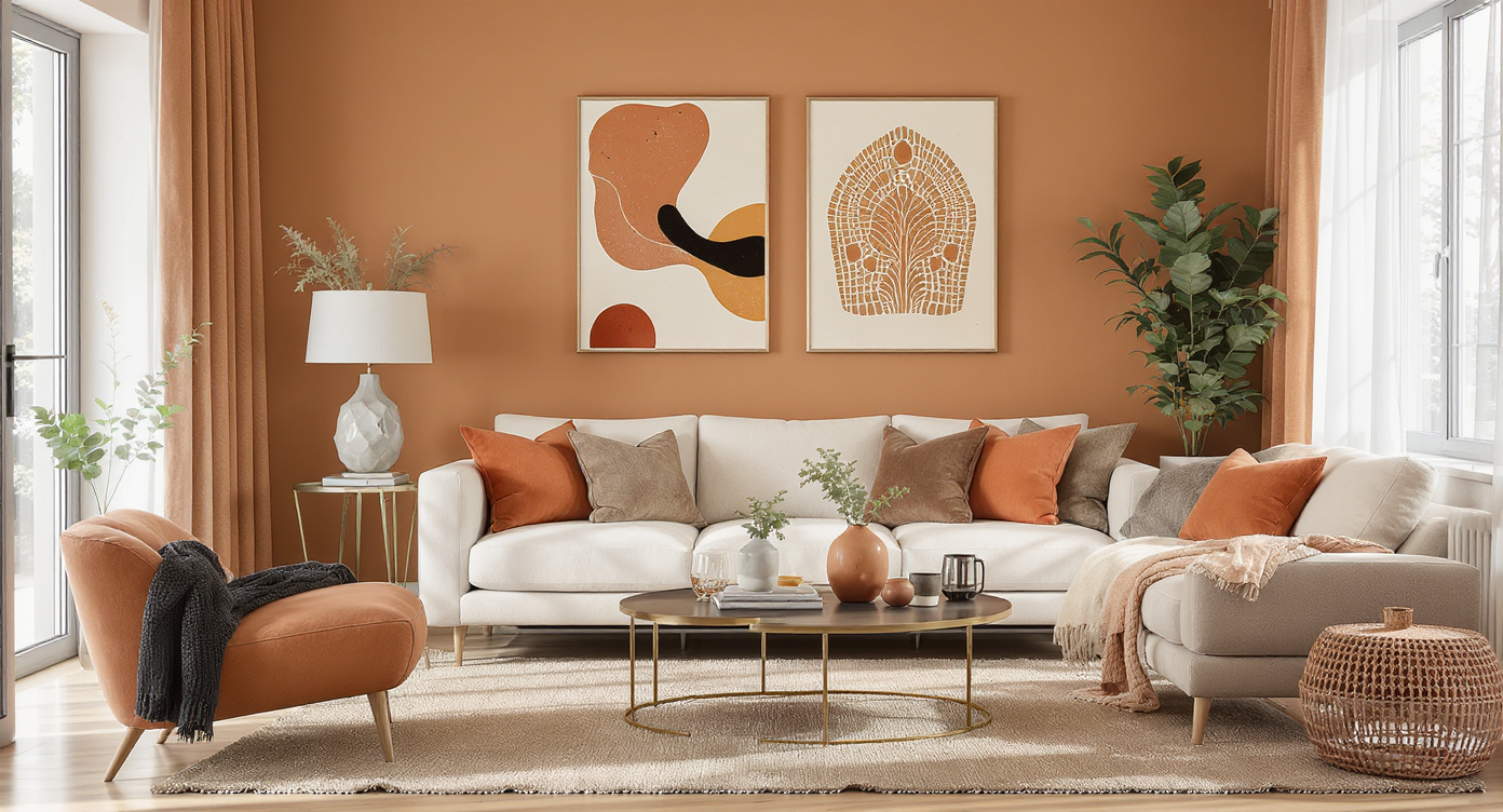
Moving Beyond Minimalism: The Emotional Power of 2026 Colors
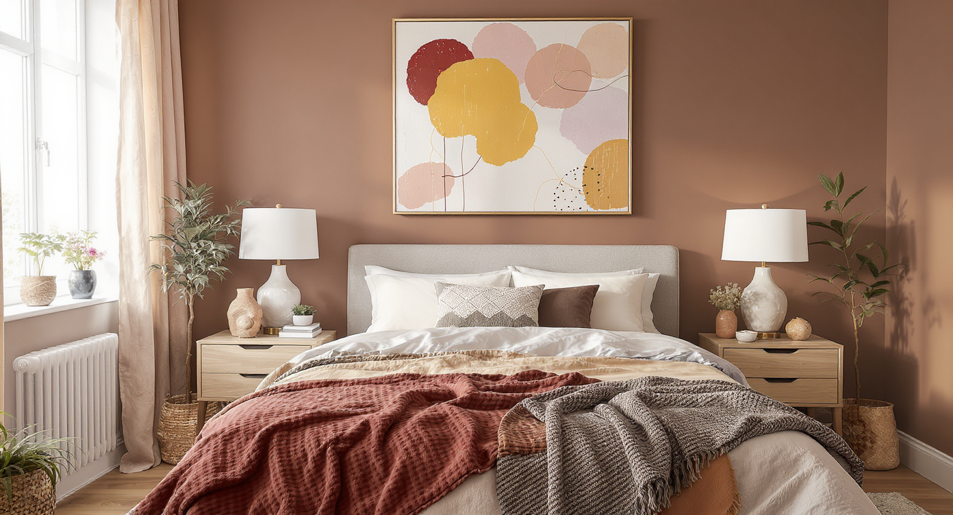
Explore the emotional impact of the 2026 color palette in this inviting contemporary bedroom.
For much of the past decade, home color palettes erred on the side of caution: pale beiges, cool grays, and barely-there whites made for universally appealing, if sometimes forgettable, backdrops. By contrast, the 2026 approach says goodbye to safe sameness and embraces colors that tell a story. Browns and umbers are taking center stage as foundational neutrals. Interior architects use these earthy hues to anchor open-concept rooms and to bridge contrasting accent shades, creating a sense of flow.
Contemporary designers often cite umber’s capacity to evoke calm and stability without feeling dull. An umber-toned living room, for example, immediately feels grounded, especially when paired with textured area rugs and abundant wood. Elsewhere in the home, colors like pistachio-chartreuse inject a playful vibrancy, think kitchen accents or a hallway that greets you with energy every morning. The sharp move towards expressive color is not just aesthetic; homeowners report feeling more connected to their spaces when colors feel intentional and personality-driven, which aligns with ongoing shifts toward comfortable luxury noted in 2026 interior design forecasts.
Expert Insight
A couple completing a home office makeover were hesitant to stray from their usual whites and greys. On a whim, they tried a sample of ochre on one wall and instantly found the room warmer and more productive—a testament to the new optimism of 2026 color trends.
-
Real-Life Application: How to Use the 2026 Palette at Home
Learn how to apply the 2026 color palette effectively in everyday spaces for a psychological boost.
Applying the 2026 color trend at home depends as much on psychology as it does on technique. Earthy umber, for example, excels in large spaces, a family room painted in this color feels layered and cozy, especially when balanced with ochre or sky blue accessories. In one real scenario, a mid-city loft owner blended ochre drapery with pistachio-tinged side chairs, offsetting industrial edges and introducing a sense of lightheartedness.
For hesitant homeowners, designers recommend starting small. A set of lemon-vanilla throw pillows or a sky-blue kitchen backsplash can act as inviting entry points into bolder color choices. This principle reflects a broader movement toward spaces that look curated over time, with color used to signal areas for relaxation, creativity, or socializing. When planning a room refresh, many find it useful to visualize changes before committing, a task now made more accessible through platforms like ReimagineHome.ai, which lets you preview color combinations and layouts quickly. This prevents costly regrets and helps ensure each element fits cohesively into the existing environment.
-
Nuance, Judgment, and the Art of Color Pairing
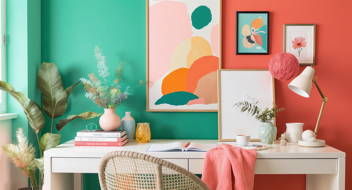
Master the art of color pairing in your workspace with insights from the 2026 color trend.
Navigating the transition from neutral to expressive interiors is all about balance. Not every room benefits from the same intensity; a pistachio-chartreuse powder room delights, but may overwhelm an entire open-plan living space. Judgment calls matter, that's where knowing the undertones becomes critical. For instance, desaturated sky blue is gentle enough to sit quietly alongside existing neutral walls, making it an adaptable choice for bedrooms or studies. Meanwhile, ochre's sunbaked warmth offers unexpected compatibility with both antique wood and contemporary metal fixtures.
Color also solves practical design questions. Deep reds and burgundies, once rare beyond dining rooms, are surfacing in everything from kitchen cabinetry to accent rugs. A city apartment dweller recently brought life to a windowless hallway with a confident red feature wall, complemented by neutral floors and a playful lemon-vanilla bench. Anchoring bold colors with grounding neutrals and tactile textures is the secret to real-world harmony, and responds to broader trends in natural materials and layered design approaches, much like the palettes noted in the 2026 color of the year selection.
-
Common Mistakes to Avoid with the 2026 Color Trend
- Overcommitting to a single bold color: Filling an entire open-plan area with one dominant hue, such as bright red, can feel oppressive rather than joyful. Layer in smaller doses and soften with earth tones.
- Ignoring undertones: Pairing cool-leaning sky blue with warm ochre without considering underlying tones may create tension. Evaluate natural and artificial light, and test colors side by side before painting.
- Skipping visualization: Not previewing wall, upholstery, or accessory colors in your specific room increases the risk of choosing a palette that clashes or feels “off.” Spend time experimenting on digital tools like ReimagineHome.ai to avoid costly missteps.
-
Expert Tips and Trade Secrets for Using Color
- Designers often suggest painting a sample swatch on multiple walls and observing it at different times of day, the same ochre can look rich and golden in the afternoon but muted and brownish at night.
- Color drenching, using a single color on walls, trim, and even furniture, can work wonders in small spaces, as noted in 2026's trend report, but it's most successful when the color is toned down and well-coordinated.
- Measurable impact: Studies and designer field reports show that rooms with coordinated, intentionally chosen color palettes receive higher satisfaction scores from homeowners, suggesting that color not only changes perception, but genuinely influences mood.
-
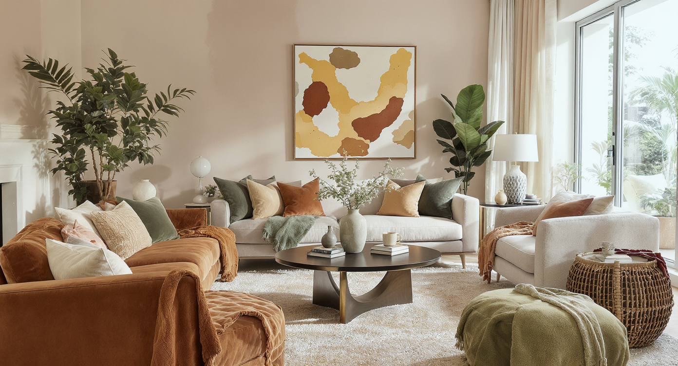
Visualizing Your Color Story for a Cohesive Outcome
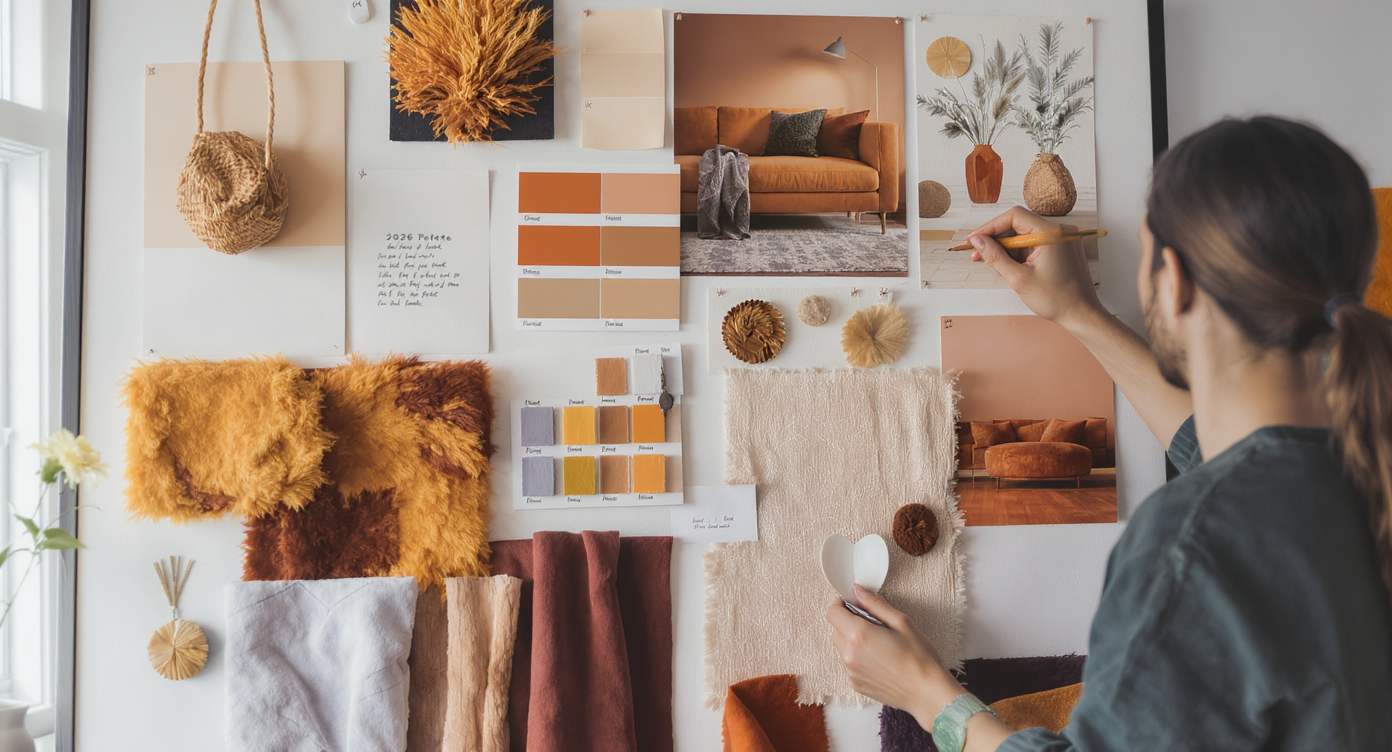
Visualize your color story for a cohesive outcome with an inspiring mood board following the 2026 trend.
The best way to plan your space, whether you’re deciding between two trending palettes or hoping to avoid mismatched pairings, is to visualize before making changes. Sensory cues can help: imagine the gentle serenity of desaturated sky blue in a bedroom, or the inviting vibrance of red and ochre in an entryway. Realistically, many homeowners find online design tools such as ReimagineHome.ai indispensable for previewing paints, furnishings, and finishings without lifting a brush.
Consider a practical scenario: A young family wishes to update their living space but disagrees on commitment to bolder hues. They upload photos of the room, experiment with different versions, one emphasizing earthy umber, the other prioritizing lighter sky blues, with side-by-side comparisons revealing how each option interacts with existing floors and daylight. The final decision blends both, illustrating how previewing results makes confident choices possible and sidesteps costly redesigns later.
Visualization Scenario
Imagine standing in your sunlit kitchen, the light catching on pistachio-chartreuse cupboards while a muted sky-blue wall offers a sense of tranquility. The effect is as if you've imported a summer morning indoors—calm, energized, and uniquely yours.
Frequently Asked Questions About 2026 Color Trends
- Are bold colors harder to live with than neutrals? Thoughtfully applied, vibrant hues can feel just as livable as neutrals, focus on balance and personal resonance.
- What is the best way to audition color ideas before painting? Digital visualization tools like ReimagineHome.ai let you preview changes safely before committing.
- Can you mix earth tones and saturated brights in one room? Absolutely, as long as one palette anchors the space and accents are carefully chosen in supporting roles.
- Is color drenching a good idea for small rooms? Done with subtle or mid-tone shades, color drenching can add coziness and visual interest without overwhelming the space.
- Which 2026 color works best with existing wood tones? Both umber and desaturated sky blue are versatile and harmonize well with most woods.
The Lasting Value of Bold Color in the Home
Adopting the 2026 color trend is about more than making a statement, it's a reflection of changing attitudes toward the spaces where we live and gather. Earthy and energetic colors are supplanting the safe, "sad beige" era, inviting a more layered and harmonious feel that looks contemporary while remaining deeply personal. Tools like ReimagineHome.ai help homeowners move from inspiration to action efficiently, ensuring that each color choice enhances well-being without regret.
By grounding bold tones in practical application and previewing results, anyone can achieve a space that feels both modern and timeless, ready to welcome the vivid color stories of tomorrow.