
TL;DR
Off-white paint colors are the easiest design trend to make rooms feel bigger and brighter without turning stark. The right undertone (warm, cool, or complex) pairs with any interior design style, from Scandinavian to Japandi. Upload a photo to ReimagineHome.ai to visualize multiple off-white options, trim pairings, and lighting scenarios in seconds before you buy a single sample.
Why Off-White Paint Color Trends Matter Right Now
Explore subtle undertones in off-white paints that enhance room mood and complement lighting.
Off-white paint is the most reliable way to make a room feel bigger and brighter while staying soft and livable. Choose an off-white with the right undertone and sheen, and you’ll get a clean backdrop that flatters modern decor without looking stark. At a glance
- Undertones decide the mood: warm (creamy/taupe), cool (gray/green), or complex (greige with a whisper of pink).
- Light Reflectance Value (LRV) between 72–88 keeps rooms luminous without glare.
- Trim and ceiling pairings matter more than you think; aim for a 3–5 LRV point difference for gentle contrast.
- Small spaces benefit most: off-white visually expands square footage and calms visual noise.
- AI design tools now let you upload one photo and see paint, trim, and furniture combinations instantly.
- ReimagineHome.ai produces realistic room makeovers from one photo, no measurements required.
Try ReimagineHome.ai now to preview trending interior design styles 2025, compare undertones, and get home design inspiration before you paint. For more ideas, visit the ReimagineHome.ai blog for AI interior design tips and before-and-after room makeovers.
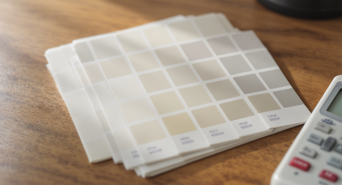
72–88 LRV off-whites reflect most light: What’s Driving This Design Trend
Off-white paints with 72–88 LRV brighten rooms effortlessly, enhancing spaciousness and comfort.
Off-white paint colors with an LRV (Light Reflectance Value) between 72 and 88 bounce a significant amount of light back into a space, which is why they’re topping design trends lists. When you want rooms to feel bigger and brighter without the clinical edge of pure white, off-white is the sweet spot. Three cultural drivers are shaping this interior design style: working from home, smaller urban footprints, and a broader move toward quiet luxury. Off-whites soften the edges of modern decor while keeping it crisp enough for focus and video calls. They also adapt to global interior design style inspiration—from Scandinavian pale woods to Japandi minimal warmth—by letting texture do the talking. A big user pain point is choosing an undertone. The easy rule: match undertone to your fixed finishes.
- Warm floors/counters (oak, travertine, brass): choose creamy or taupe-leaning off-whites.
- Cool finishes (marble veining, chrome, gray stone): pick gray- or green-leaning off-whites.
- Mixed materials: land in greige for balance.
Anecdote
In a 110-square-foot rental living room with north light, a balanced greige off-white calmed the gray sofa, warmed the oak coffee table, and finally made the vintage rug’s reds read true. The tenant kept the ceiling at 50% of the wall color and the room instantly felt a size up.
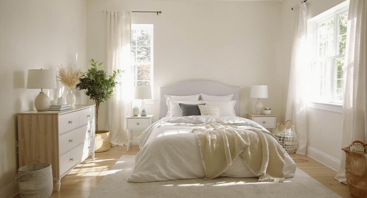
2700–6500K bulbs shift undertones: How This Style Looks in Real Homes
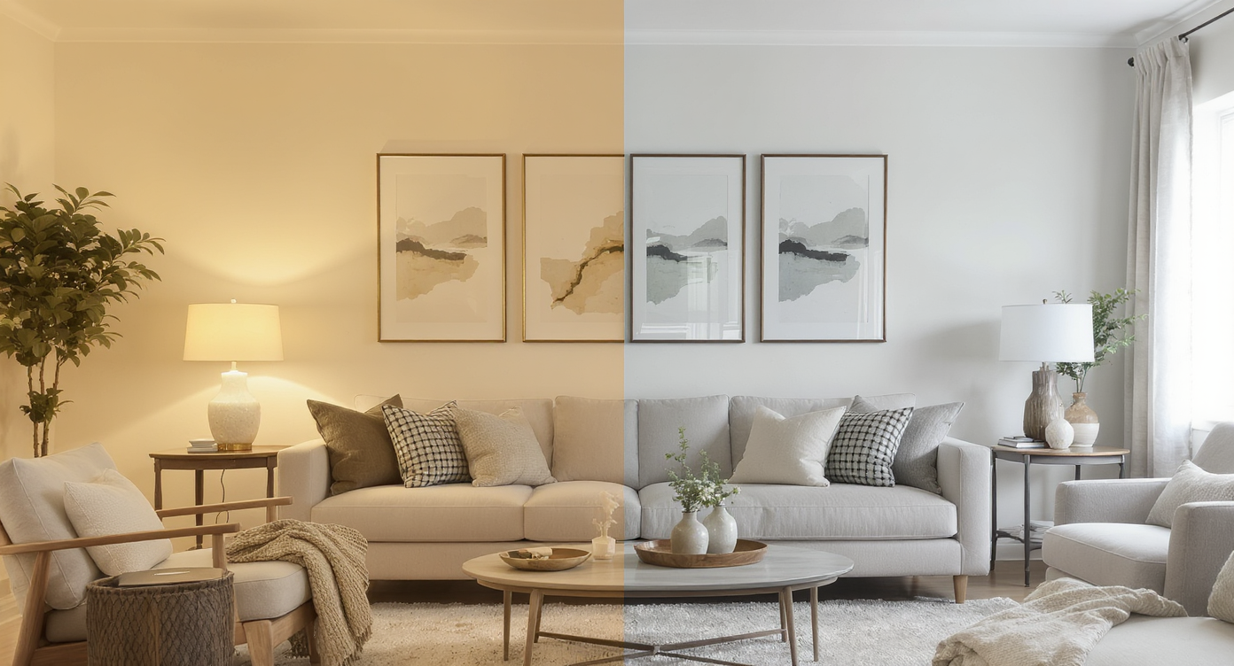
2700–6500K bulbs alter off-white undertones, shifting room atmosphere from cozy warmth to crisp brightness.
Color temperature swings from about 2700K (warm) to 6500K (cool daylight) and can visibly push off-white paint warmer or cooler throughout the day. That’s why the same can of paint looks cozy at night but crisp at noon. Here’s how off-white reads across real homes and interior design styles: Warm, creamy off-white (LRV ~78–84):
- Pairs with oak, linen, boucle, terracotta, and woven shades; think Soft Boho or Farmhouse Modern.
- Feels sunlit even in north-facing rooms; great for bedrooms and living rooms seeking quiet luxury.
- Sings with marble, slate, stainless, and black accents; ideal for Minimalist or Industrial modern decor.
- Lowers glare in bright south-facing spaces; perfect for kitchens with lots of windows.
- Bridges warm and cool furnishings, a fix for open-plan homes with mixed woods and metals.
- Provides gallery-level calm without looking cold; great for displaying art and layered textures.
AI restyles render in under 10 seconds: Modern Tools to Explore Off-White (and Why ReimagineHome.ai Wins)

AI tools like ReimagineHome.ai enable swift, realistic off-white color previews in under 10 seconds.
AI restyle tools can render new wall colors from one photo in under 10 seconds, which radically reduces guesswork. Here’s how today’s options stack up when you’re exploring off-white paint and interior design style combinations: Mood board and floor plan tools:
- Great for gathering inspiration and testing layouts, but they can’t show how your actual light changes undertones.
- Powerful for renovations with measurements, yet time-intensive when you only want to compare paint colors and furniture finishes.
- Fastest route to “How will this look in my room?” because they use your real walls, trim, and lighting.
- Most accurate for quick, realistic restyles of your current room—paint, trim, and decor—directly from a single photo.
- Style recommendation engine helps you compare Scandinavian, Japandi, Minimalist, and Industrial palettes against multiple off-white options.
- Photo upload → instant decor suggestions means you can test rugs, woods, and metals alongside paint to prevent undertone clashes.
Test 6–8 variations in under 5 minutes: Step-by-Step — Try This Style Using ReimagineHome.ai
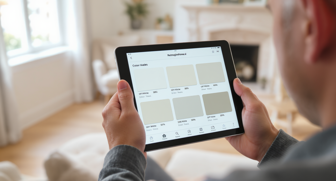
Preview 6–8 off-white shades in minutes with ReimagineHome.ai’s user-friendly interface for confident choices.
You can preview 6–8 off-white variations in under five minutes with ReimagineHome.ai. Here’s a simple workflow that mirrors how designers test paint: 1) Shoot your space
- Take one clear photo per wall during daylight. Turn off lamps to capture natural color.
- Choose an interior design style (Scandinavian, Japandi, Minimalist) to get tailored palettes and modern decor pairings.
- Test a warm cream, a cool gray-tinged off-white, and a balanced greige. Note how floors and counters react.
- Try the same color at 50% on the ceiling for a cocooning effect, or keep trim 3–5 LRV points lighter for crisp definition.
- Preview 2700K vs 3000K bulbs; warmer lamps often tame cool undertones at night.
- Bookmark two finalists and then sample just those IRL to confirm. Less waste, more confidence.
Visualization Scenario
Upload a shot of your dining room at noon. In seconds, compare warm cream walls with tone-on-tone trim versus a cooler off-white with black metal chairs and a pale oak table; toggle 2700K vs 3000K lighting to see which dinner mood you prefer.
FAQ
Q: What’s the best off-white for small apartments? A: Look for LRV 80+ to maximize brightness and choose a warm undertone if your floors are oak or maple. Keep trim within 3–5 LRV points for a seamless, larger feel. Q: How do I choose an interior design style before picking paint? A: Start with 2–3 inspiration images (Scandinavian, Japandi, Minimalist), then use ReimagineHome.ai to visualize how each style’s materials and metals look against different off-whites in your actual room. Q: Can I visualize a room makeover from one photo? A: Yes. ReimagineHome.ai lets you upload a single image and preview wall colors, trim tweaks, and decor suggestions instantly—no measurements needed. Q: What color temperature bulbs should I use with off-white walls? A: 2700–3000K is a safe starting point for warm, inviting light. Go warmer to soften cool undertones, cooler to emphasize crisp modern edges. Q: Which AI design tools are most accurate for paint decisions? A: Tools that restyle your actual photo are most helpful. ReimagineHome.ai emphasizes realistic lighting and material context, so undertone decisions feel easier and more accurate.
One photo, many futures: Visualize Your Style’s Next Chapter
One photo can unlock many futures for your space. Whether your next chapter leans Scandinavian calm, Japandi warmth, or quietly luxurious minimalism, off-white paint is the most forgiving canvas—and the quickest way to a bigger, brighter room makeover. Upload a photo to ReimagineHome.ai and watch your interior design style click into focus: undertones resolved, lighting tested, decisions simplified.