.svg)

.svg)

9 Hidden Variables That Affect Your Paint Color Match
TL;DR
Paint color matching is far less predictable than most homeowners expect. Variables in materials, lighting, formulas, and store equipment can turn a single paint code into several noticeably different results. Understanding these factors leads to fewer surprises and more satisfying results when choosing paints and textures for your home.
The Elusive Perfect Paint Match
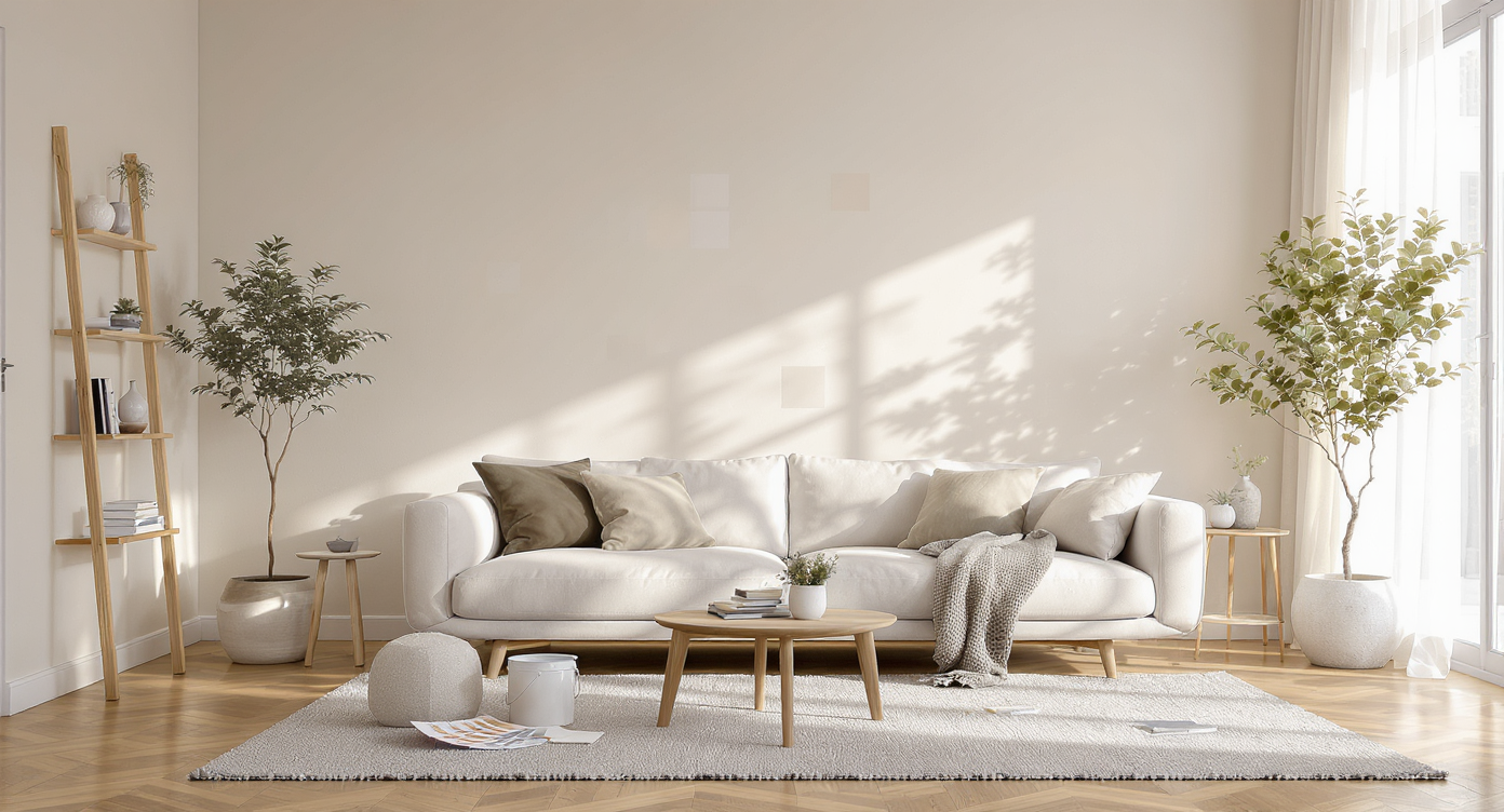
Swatches tested on a living room wall reveal subtle color mismatches compared to fan decks and paint cans, capturing real paint challenges.
Selecting a paint color may seem simple, but achieving an exact match from swatch to wall is notoriously tricky. Even when using precise color codes and formulas, subtle variations can appear and leave homeowners wondering what went wrong. These discrepancies show up across brands and even from one store location to another, making the process unexpectedly complicated. For anyone investing time and money in a fresh coat—whether on a garden shed or an interior feature wall—understanding why color coordination sometimes fails will save time, effort, and disappointment. This list dives into the less obvious reasons your final result may differ from what you envisioned, with practical observations and expert analysis for every stage of your next painting project.
-
1. Formula Versus Machine Matching
Comparing formula-based and machine-matched paint samples under a spectrophotometer device at a professional paint store counter.
Paint colors can be created using either pre-existing manufacturer formulas or custom-matched by a store’s spectrophotometer. Formula matches use exact recipes that have been tested for consistency. Machine matching, on the other hand, relies on scanning a sample and creating a blend based on what the device perceives. This process introduces subjectivity, as not all machines are calibrated equally. For historically tricky hues—like deep reds or off-whites—the margin for error increases. Many professionals suggest confirming with staff whether they’re pulling from a database formula or using the color matching machine. As outlined in our guide to choosing a paint color you’ll love, specifying your preference upfront matters more than most realize.
-
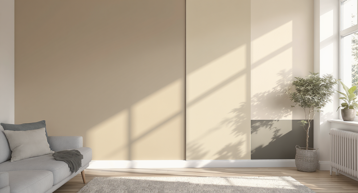
2. Paint Base and Product Line Differences
Same color code, but the interior matte and exterior satin paint bases show clear differences in color and finish when applied side-by-side.
Even with an identical color code, the actual paint base can shift your result. Brands use proprietary bases that vary in undertone, transparency, and chemical makeup. Paints & textures can therefore take on a slightly different color or intensity. For example, applying the same red formula to an interior matte base and an exterior satin base may yield two distinct looks, due to additives for durability or weather resistance. This effect is pronounced when substituting product lines, such as using a premium versus a value formula within the same brand. Reading labels and consulting the store team can help clarify which replacement bases or sheens might introduce deviations.
-
3. Sheen Isn’t Universal
Terms like "satin" or "semi-gloss" suggest uniformity, but the realities of paint manufacturing mean different brands—and sometimes even different lines within one brand—produce slightly different sheens. Light reflects differently off eggshell compared to satin, even when both claim to be the same finish. In practice, professionals see color looking darker with a lower sheen and appearing lighter with more gloss, especially under bright light. If consistent paint previews are critical for your space, try a small sample of the precise finish you intend to use, and apply it in the actual environment you’ll be painting.
-
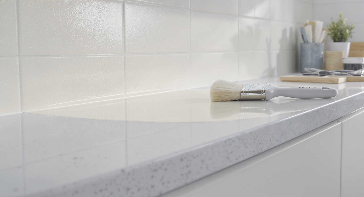
4. Primer, Material, and Surface Prep
The color and type of the underlying surface can dramatically change the appearance of your topcoat. Painting over raw wood, patched drywall, or previously painted surfaces—all without primer—often shifts both color and coverage. Paint previews on raw pine may absorb pigment unevenly, while surfaces primed in white will make most colors appear slightly brighter. Achieving better color coordination typically requires a suitable primer and consistent surface prep so the undertones of the substrate do not influence your final hue.
-
5. Lighting Conditions and Viewing Angles
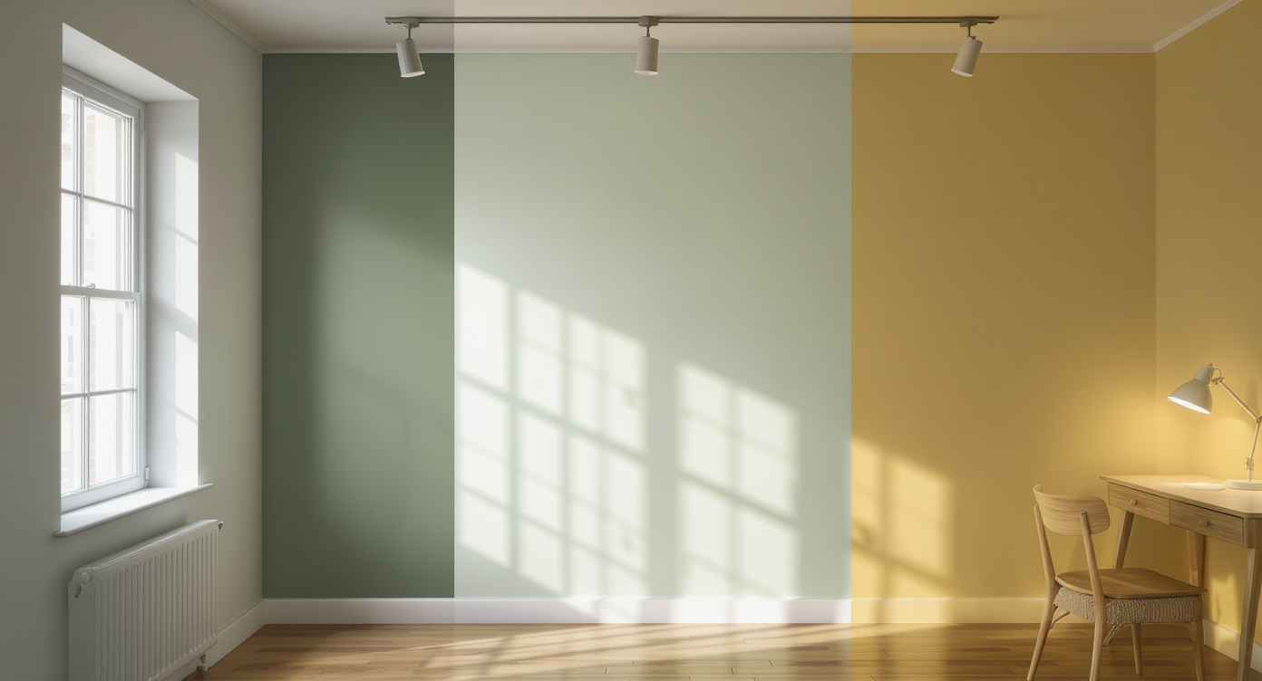
The same paint color looks dramatically different under sunlight, fluorescent, and evening lamp lighting on a single inner wall section.
Lighting impacts perceived color more than almost any other factor. The same paint can look drastically different outdoors in midday sun, under store fluorescents, or beside a window in soft evening light. Direct comparisons made under different conditions will often exaggerate differences, leading to disappointment once the paint cures in situ. Testing large paint swatches at home, on the intended wall, and observing them at different times of day is a strategy endorsed by pros and by color systems such as the method detailed in our 5-step color selection guide.
-
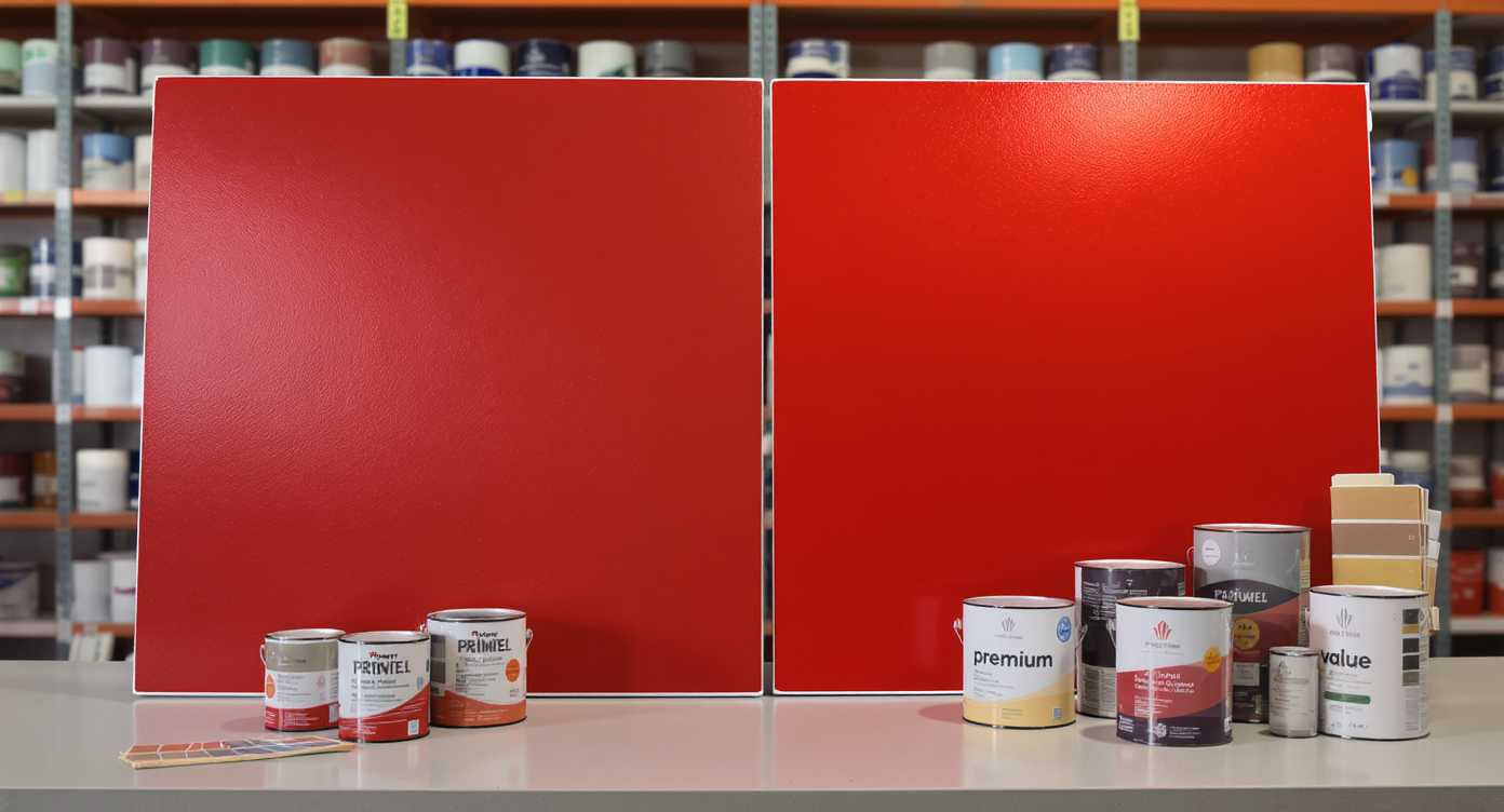
6. Store Equipment Calibration
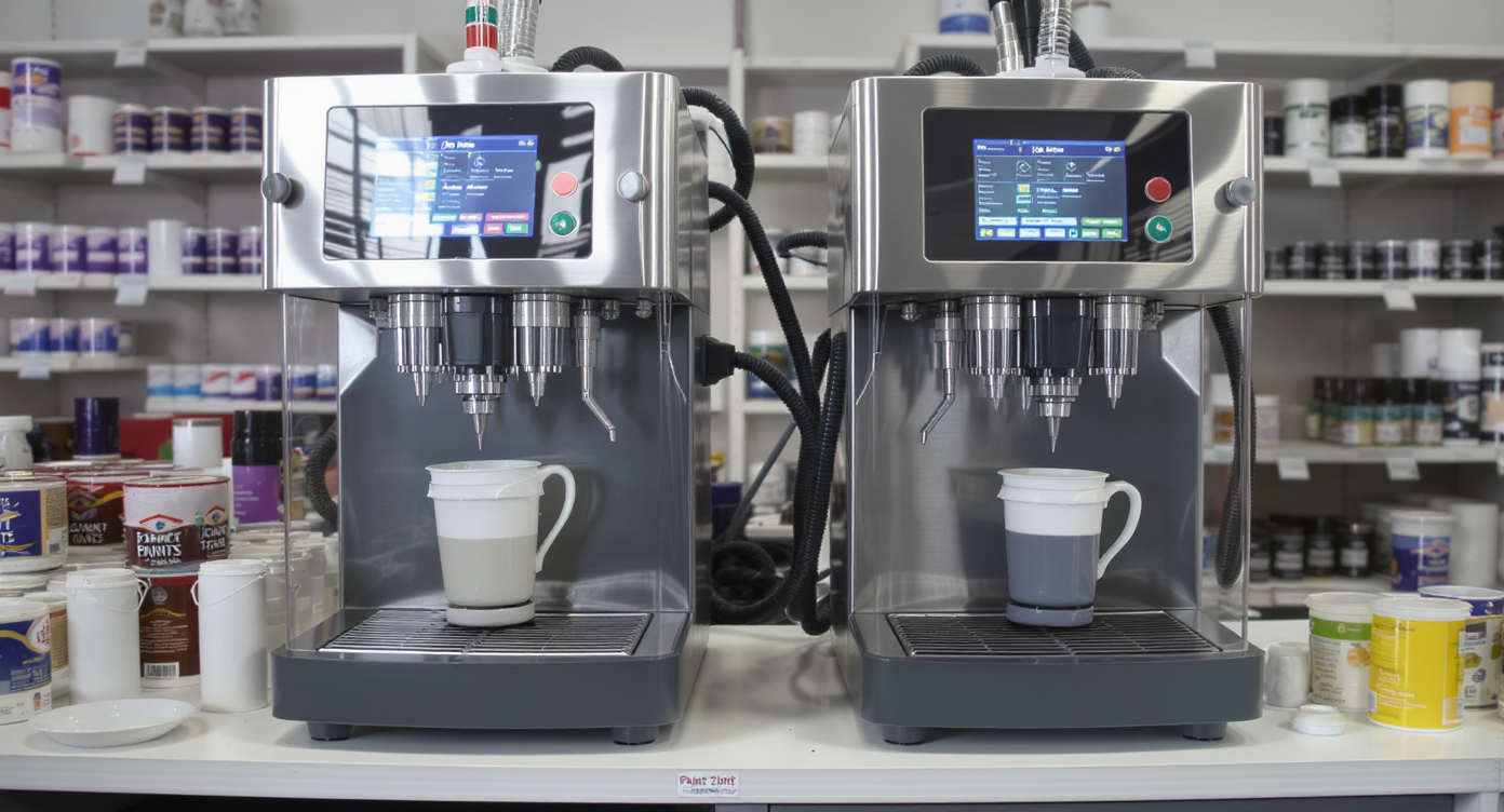
Two identical tinting machines individually dispense the same color, but slight calibration variances result in differing paint sample shades.
Even within the same brand, two stores may have different results if their tinting equipment is not precisely calibrated. Small mechanical or software discrepancies—sometimes as simple as pigment lines needing a cleaning—can push two batches of the "same" formula toward visibly different outcomes. Savvy paint department staff frequently recommend purchasing all the paint for a project from the same store at the same time, especially for color-critical projects. If you return weeks later or switch locations, you risk subtle but irksome mismatches.
-
7. Paint Age, Stirring, and Boxing
Paint components can settle quickly, and a color mixed even a few hours before application may need a thorough stir. This is especially true of paints & textures with heavy or deep pigments. If you are using more than one can, “boxing” the paint—combining all cans into one larger container and mixing thoroughly—ensures uniformity. This practice is standard for professional painters who want to avoid wall-to-wall discrepancies, as minor differences in pigment concentration are common from batch to batch. Failing to box or to stir before each use is a guaranteed way to see visible striping or patchiness.
-
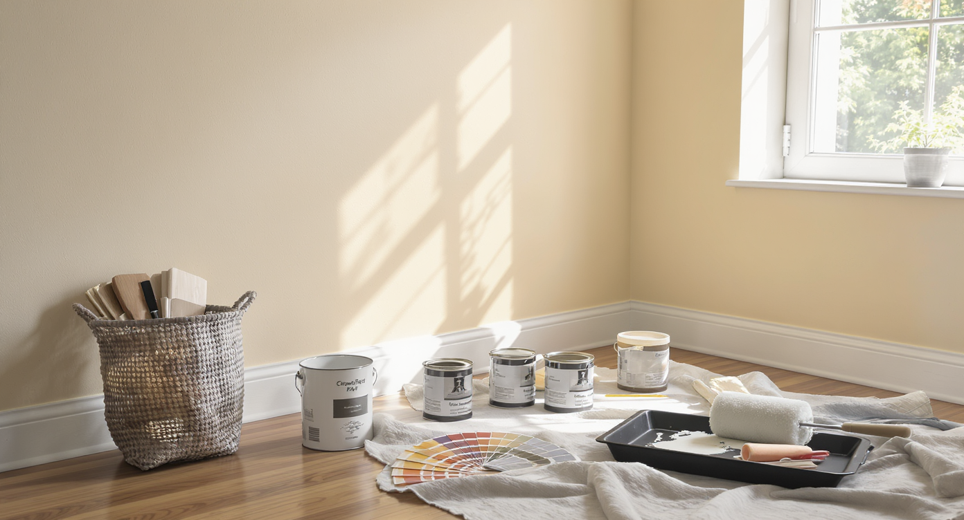
8. Sample Size and Swatch Testing
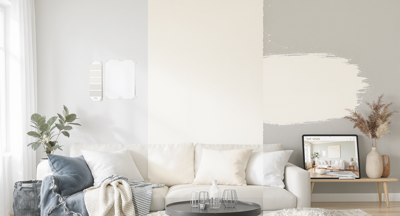
Compare small paint chips, large wall samples, and digital previews to reveal how paint color actually appears before deciding.
Small paint chips and sample cards rarely tell the whole story. Color plays tricks on the eye, especially when surrounded by old paint, wood, or varying light. Full wall or at least large poster board samples give a much more accurate sense of the final appearance. Digital paint previews—such as uploading a room photo to REimagineHome.ai—can help homeowners quickly trial all their options, including trending palettes. For instance, popular off-white trends revealed through actual room previews allow for smarter decisions before buying gallons of paint, as demonstrated in our review of 2025 off-white color trends.
-
9. Perception and Contextual Comparison
Paint swatches on the same wall look distinct when compared side by side, but blend more under different room colors and lighting.
Humans perceive color contextually, not in isolation. Subtle variations become more obvious when swatches are compared side by side on the same surface. In a separate room or with different surrounding colors, distinctions often melt away. Understanding this helps set expectations—sometimes, striving for a "perfect match" is less relevant than ensuring the overall space feels harmonized. The key is to test in place, under actual conditions, and judge with a critical but realistic eye. DIYers tackling interior painting projects and choosing between self-application or hiring a professional can leverage digital color previews to anticipate how context will affect the end result, as discussed in this analysis of DIY painting versus hiring a pro.
Frequently Asked Questions About Color Matching
Store lighting and in-home lighting rarely match, so colors shift as your environment changes. Always test at home.
Should I always buy all my paint from the same store?
Yes, this reduces risk of mismatch from machine calibration differences or formula variations.
Can digital previews reliably predict final color?
While not perfect, digital paint previews using services like REimagineHome.ai offer a practical way to see trends and narrow your color shortlist before you commit to buying samples.
Is boxing paint necessary for small jobs?
If color consistency is critical, combining all paint cans for a single space and stirring well can prevent visible differences, even for modest projects.
Do different paint sheens really look that different?
Absolutely. Even when labeled identically, color appearance can change between eggshell, satin, or gloss options due to light reflectivity.
Realistic Expectations Deliver Better Results
Perfect color matches are the exception rather than the rule. Seasoned designers and DIYers alike contend with variations that arise from product, process, and perception. The best approach is to focus on testing substantial samples under real-world conditions, making use of tools like REimagineHome.ai for digital previews, and prioritizing overall harmony and atmosphere. By understanding where mismatches can happen, anyone can project manage their paint upgrade with confidence.


.png)