.svg)

.svg)

9 Essential Lessons for Choosing Floors in a Warm-Toned Kitchen
TL;DR
Selecting flooring for a warm-toned kitchen can make or break its visual and practical harmony. Cool gray tiles often clash with rich wood cabinetry and bring cold, dated vibes. Instead, focus on warm, organic materials and colors that complement existing features, creating a cohesive and inviting home environment.
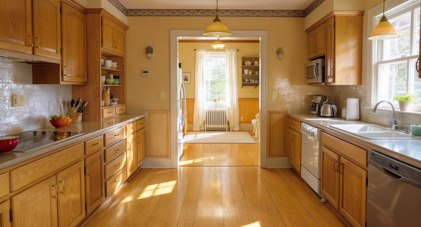
The Challenge of Kitchen Material Selection
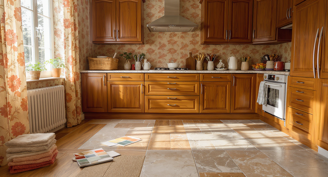
A welcoming kitchen with brown 1970s cabinets and patterned walls, where flooring samples are thoughtfully laid out to test color harmony.
Material selection for interiors has never been more complex or visually impactful, especially when balancing existing elements like 1970s brown cabinets and patterned walls. Homeowners often fall into the trap of picking tiles or flooring that look polished in isolation but undermine an entire room’s warmth once installed. Choosing between tiles, wood, or stone goes beyond personal taste—it deeply influences comfort, resale value, and daily upkeep. For those managing a kitchen update in a warm-accented home—or trying to persuade a family member against a risky choice—understanding the crucial intersection of material, color coordination, and practicality is essential. Here are nine editorially vetted lessons for picking floors that go beyond trend and serve your kitchen’s needs for years to come.
-
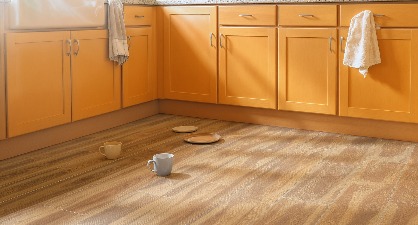
1. Understand the Power of Undertones
Flooring samples placed next to cabinetry in daylight reveal contrasting undertones in wood and tile—an essential real-world test for color harmony.
One of the most common pitfalls in kitchen material selection is neglecting undertones. Colors are not simply warm or cool in isolation; every finish, whether stone or wood or tile, contains subtle shades that may clash or collaborate. Brown wood cabinets typically have red or orange undertones, while gray tiles often skew blue. This mismatch can make a space feel uncoordinated. Designers often advise laying flooring samples next to cabinetry in various lighting throughout the day. This approach will quickly reveal if undertones clash or quietly harmonize, a step highlighted when considering the short shelf life of gray-centric palettes as seen in the risk of “very 2020s” interior trends.
-
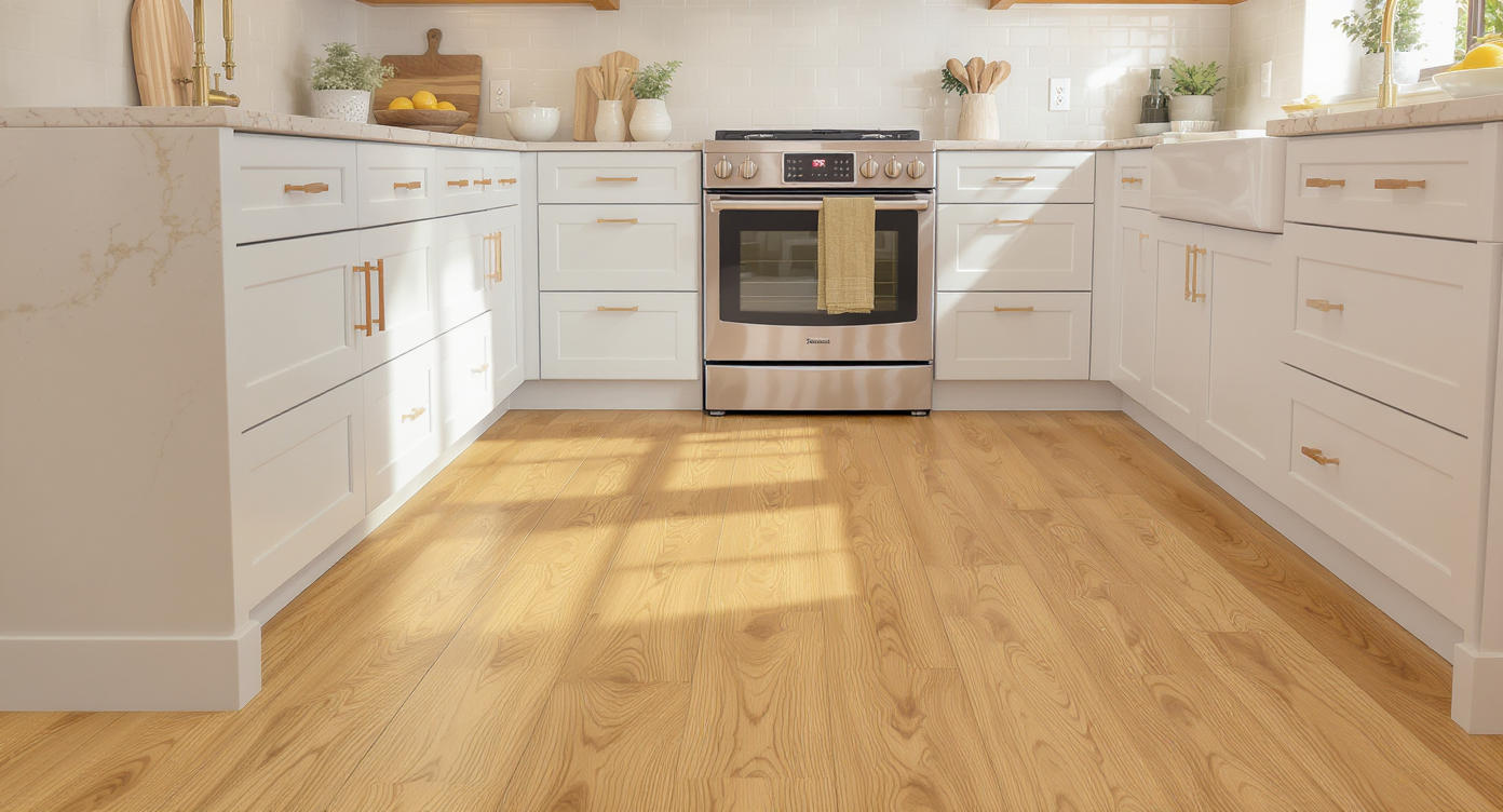
2. Warm Materials Suit Warm Spaces
Blending beige tiles, bamboo planks, and matte terra cotta flooring complements wood cabinetry in a warm, inviting kitchen setting.
Homes dominated by wood, soft browns, and earthy tones demand flooring materials that reinforce that comfort. Tiles in shades of beige, taupe, or natural stone instantly lend cohesion, echoing the envelope of existing cabinetry and trim. For kitchens that already radiate 1970s warmth, cork or bamboo can provide durability and an inviting tactile underfoot. Terra cotta tiles, especially in a mat finish, offer an organic bridge between tradition and contemporary sensibility while sidestepping the coldness of concrete or slate.
-
3. The Downside of Cool Grays—And What to Do Instead
Gray tiles may still seem functional, but they deliver a cold, utilitarian feel in spaces defined by wood or soft finishes. Their widespread use in the last decade has aged quickly—making rooms appear sterile and visually “off” when paired with brown cabinets or patterned walls. As outlined in our breakdown of fast-fading interior design trends, swapping gray tiles for mid-tone woods or stone with subtle veining ensures longevity and immediate harmony.
-
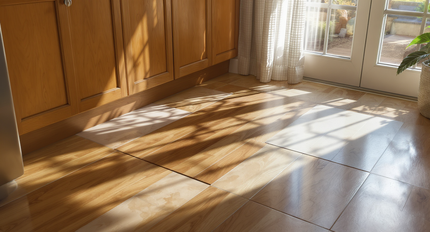
4. Factor in Comfort and Everyday Practicality
Engineered wood, laminate, and cork flooring in a warm-toned kitchen, visually demonstrating each surface’s comfort and everyday practicality.
Flooring is more than a style decision. For older homeowners or those who spend hours standing in the kitchen, comfort is critical. Tile and concrete are unforgiving, amplifying joint fatigue and risking breakage of dropped dishes. Experts often recommend engineered wood, laminate, or cork for spaces where both resilience and comfort matter. Cork, for instance, has evolved with improved sealants for stain resistance and easier maintenance, offering a forgiving surface in case of spills or wear.
-
5. Light Flooring Conceals More Than It Reveals
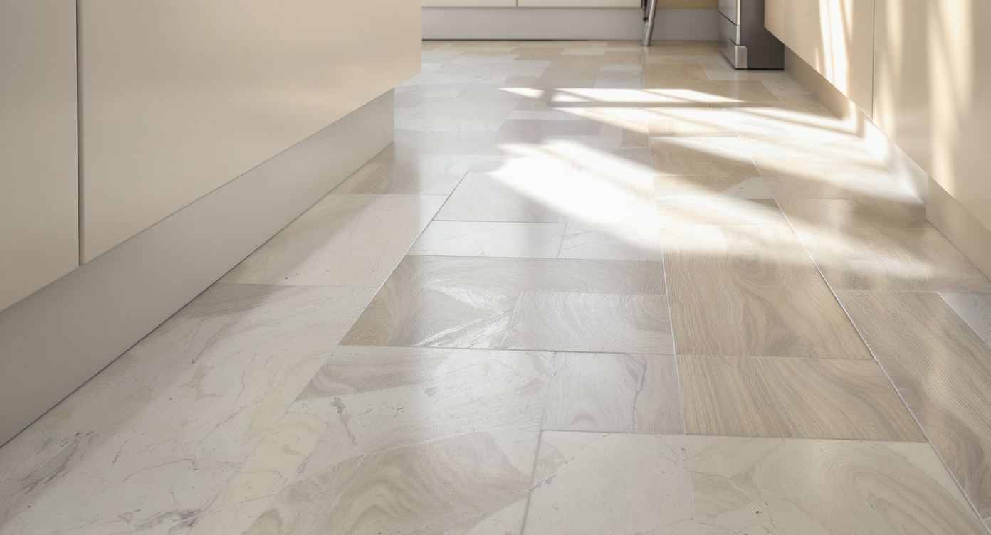
Lightly patterned stone-look tile or mid-tone wood masking crumbs and wear in a warm kitchen, unlike more demanding pure white floors.
While pure white or cream tiles look crisp, they are maintenance-intensive in kitchens and foyers, requiring frequent cleaning to hide dirt and scuff marks. Instead, a lightly patterned or mid-tone wood or tile can mask crumbs, dust, and everyday wear. Flooring with subtle pattern or blended color variation, such as warm stone-look porcelain tiles, provides a forgiving base for busy households—a detail many overlook until the first spill sets in.
-
6. Pattern Selection Changes How Space Feels
The choice between large squares, herringbone, or plank-shaped tiles significantly influences a room’s rhythm. Overly large or severe tiles can echo commercial or garage settings. Herringbone patterns, especially in natural stone or plank tiles, create movement and soften the impact of a utilitarian tile. Selecting grout color is equally vital; lighter grout may look fresh but can prove difficult to maintain. Stain-resistant grouts or a slightly deeper shade can offer both form and function.
-
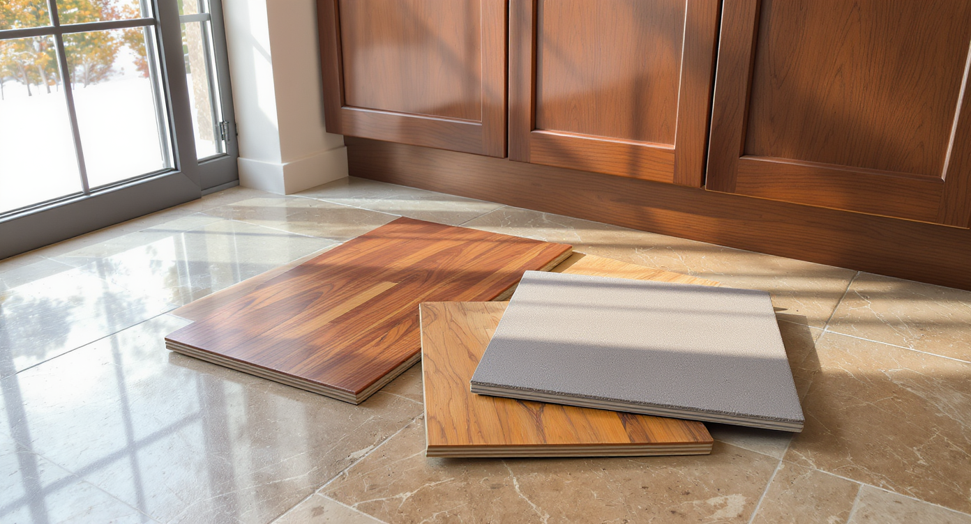
7. Visualize in Context, Not Just in Isolation
Comparing assorted flooring samples directly against kitchen cabinets, wallpaper, and drapery in shifting natural light demonstrates real-world context.
It’s easy to pick flooring in a showroom under fluorescent light, but real-world results hinge on context. Always review samples against cabinets, under different lighting, and with wallpaper or drapery considerations. Taking photos at various times of day, or, better yet, using platforms like REimagineHome.ai to preview material swaps digitally, helps homeowners see the impact before installation—a level of caution that helps avoid disappointments as we explored in decisions around tile and color coordination.
-
8. Listen to the Lessons of Dated Design Trends
Repeatedly, kitchens fall victim to trends that look fresh but age rapidly: the "all-gray everything" approach, high-gloss tile, or ample fluting. Not only do these depart from a room’s foundational palette, they can impact resale and daily satisfaction. Maintaining a focus on authentic materials and tonal continuity can prevent regret. Refer to the guide on trends to skip and their modern alternatives for strategies in creating warmth without sacrificing a fresh look.
-
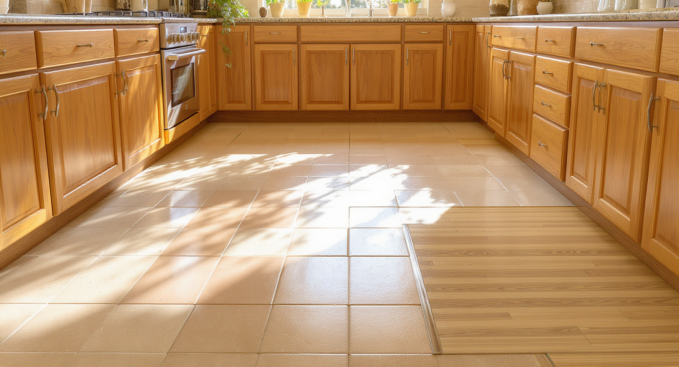
9. Make Room for Personalization—But Respect the Architecture
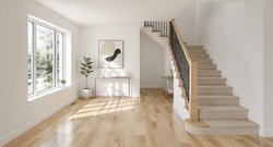
Carefully updated 1970s kitchen featuring wood cabinetry and harmonizing cork flooring, with a subtle patterned transition into the foyer space.
Homes from eras like the 1970s offer built-in character, which can be elevated rather than erased. Flooring choices should complement wood cabinetry, original fixtures, and the home's scale. Warm wood or cork can read as an upgrade, while starkly modern concrete, monochrome tiles, or black slate may jar in a retro setting. Personal touches—such as integrated patterns, subtle color shifts, or thoughtful transitions between the kitchen and foyer—preserve charm while updating utility. Envisioning potential changes with design visualization tools can help strike the right balance between nostalgia and function, as explored in choosing between tacky and timeless moves in timeless vs. tired interior finishes.
FAQ: Flooring Choices for Warm Kitchens
Mid-tone or warm wood, bamboo, cork, and select stone-look tiles usually deliver the best visual cohesion in kitchens anchored by wood cabinetry.
Is gray tile always a bad idea for kitchens?
Not always, but most gray tiles read cold and can clash with brown cabinets. A warmer gray or one with brown veining may blend, but testing with your cabinet color is essential.
What flooring is easiest on the joints?
Cork, bamboo, and engineered wood offer resilience and softness compared to hard ceramic tile or stone, making daily use less physically demanding.
Can I preview how new floors will actually look?
Yes. Digital tools like REimagineHome.ai allow you to visualize real room transformations before any installation or purchase.
Why do some flooring materials show so much dirt?
Very dark or very light, solid-colored flooring highlights dust and spills. Materials and colors with subtle variation or pattern tend to disguise everyday messes better.
Key Takeaways for a Cohesive Kitchen Floor
Successful material selection for interiors is rooted in seeing the bigger design picture: undertone harmony, long-term comfort, and style relevance all matter as much as personal taste. Before making any permanent choice, homeowners are well served by previewing finishes in context, considering daily maintenance, and staying clear of trends on the brink of obsolescence. Platforms like REimagineHome.ai make it easier than ever to test floor options virtually, translating ideas into visual reality and enabling informed choices that last.


.png)